Search Knowledge Base by Keyword
Radio Button
A radio button list control allows users to select a value from a defined list for data entry.
Each radio button list must be associated with a Single Named Range (SNR) in the workbook, which will constitute the location where the value will be set for calculations, as well as a List Named Range (LNR) that defines a series of valid values from which the user can make their selection.
Named Range
A list of all Single Named Ranges (SNR) from the workbook. The value entered into this input will be sent to the calculation engine, as if the user entered the value into the spreadsheet model.
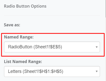
Selecting a named range from the list may default some of the other radio button list properties based on some metadata captured from the spreadsheet model, such as the default value.
Named ranges containing formulas are excluded from the list, as well as named ranges that have already been bound to a different input in your user interface.
Enable Formula Override
This option becomes available only if you select a Name Range that contains a formula.
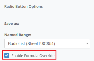
Enabling this option allows the formula result in the control to be overwritten. This essentially means that users can set a new value for this control during runtime, and the associated formula will not change the cell value once edited.
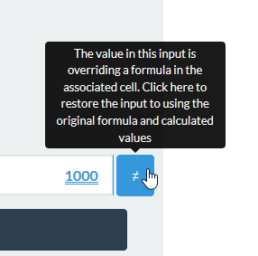
If a cell with Enable Formula Override is edited, a button will become available right next to the cell, that can be used to clear the formula override and revert the value of the cell back to the original fomula-based calculated value.
Force Override on Save
This option becomes available only when Enable Formula Override is enabled, and the Name Range selected for the control contains a formula. Using this option is limited to the scenario in which the published application has an Action Button control with Save event.
When you Save a record in the published application, each control that has Force Override on Save option enabled will save its current value, and override the formula at the same time, even if you haven’t overwritten the value in the control manually. Force Override on Save option does that automatically when the record is being saved.
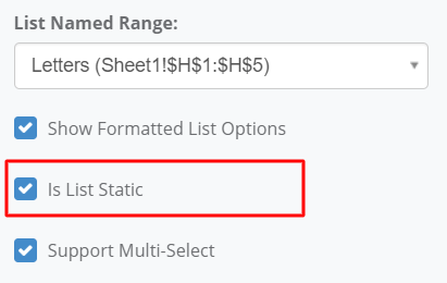
List Named Range
A list of all List Named Ranges (LNR) from the workbook. The values that may be selected from this radio button list will be generated based on the values that are defined by the selected List Named Range.

List Named Ranges are one-dimensional ranges (i.e. either 1 in width or height).
Show Formatted List Options
When enabled, this feature displays the formatted value of each radio button option, as they would be displayed in Excel.
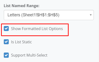
The value that is submitted for calculations is still the underlying, non-formatted value.
Is List Static
This value is determined automatically based on the contents of the associated list named range. If that range has formulas, then the list is considered static. Do not override this behavior unless you have clear instruction or understanding of this functionality.
When this option is enabled, the system assumes that the selected list for this radio button control is a range containing solely static values. This means that the list does not have values that are dynamically controlled by formulas. As a result, the system will not re-retrieve and populate this list on each request. Having this option enabled will improve calculation performance for applications with large, static lists. However, it will also prevent the list’s options from updating dynamically.
Support Multi-Select
This feature allows the user to select multiple values from the radio button list instead of a single value. Also when this option is enabled, an extra Delimiter option is available (see the description below). This feature is only available when the Style property is set to select2.
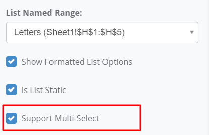
Additionally, when the Display Type is set to Standard, the radio button list controls visually appear as a series of checkboxes. As such, their multi-select functionality becomes more intuitive.
Delimiter
This option is available only when Support Multi-Select is enabled. Currently, there are three supported predefined delimiters:
- Semicolon (;)
- Asterix (*)
- Tilde (~)
The Delimiter property defines the delimiter character that is used to separate multiple selected values of a radio list control before it is sent to the calculation engine and stored in a corresponding cell referenced by a Named Range.

For example, if a list has three options Dog, Cat, and Fish, and options Dog & Fish are selected, the radio button’s value is being formed by concatenating those selected values together with the selected Delimiter. This would result in one of the following:
- Dog;Fish
- Dog*Fish
- Dog~Fish
For these radio button lists, it will be necessary to add some additional formulas in the underlying Excel spreadsheet model in order to determine whether a single value is selected or not. For example, if you want to determine whether the Dog value is among the selected radio button values, you could use the following formula:
- =ISNUMBER(SEARCH(“Dog”,A1))
Note: This example assumes that the Named Range points to the cell A1. In this case, the formula would return a TRUE value.
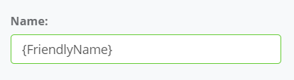
Name
The Name property constitutes the label that will appear in the user interface. Other properties, such as Tooltip, will also derive their dynamic {FriendlyName} value from this property.
Style
The Style property will determine the coloring of the radio buttons in the radio button list. The predefined color styles are as follows:
- Primary
- Info
- Warning
- Success
- Danger
Users can customize the actual corresponding styles using Cascading Style Sheets (CSS) in the Stylesheet Designer.
Display Type
Display Type property determines the visible layout of the radio button control. Each option features a different visual, but similar way to select from the list.
- Standard – Standard display will show the available options with a selection circle next to them. Users can click the circle next to a list item to select it and their selection will fill the circle with a selection marker.

- List – List option allows selecting a list item by clicking their name. The selected item box will be highlighted with a different color.

- Icon – Icon display will show each item with a checkbox next to it. Selecting an option will add a checkmark into the selection box.

Alignment
The Alignment property of the radio button control determines the orientation and layout of the radio button list items. The two possible orientations are Horizontal and Vertical.

A horizontal alignment will have the radio button list items laid out from left-to-right in a single row.
A vertical alignment will have the radio button list items laid out from top-to-bottom in a single column.
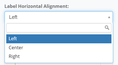
Label Horizontal Alignment
The Label Horizontal Alignment property determines the horizontal orientation of the label. This value can be set to Left, Center, or Right. The default horizontal alignment is Left.
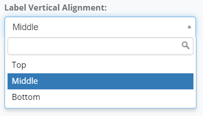
Label Vertical Alignment
The Label Vertical Alignment property determines the vertical orientation of the label. This value can be set to Top, Middle, or Bottom. The default vertical alignment is Middle.
Label Size
The Label Size property is the spacing distribution of the input control’s label vs. the input control. The maximum width of both controls cumulatively is considered to be 12 – a width of 12 for the label would indicate that the label occupies a full row within its container and the input control occupies a full row beneath it.

Any label distribution below 12 will indicate that the label and the input control occupy the same row in the user interface. The label’s width will be used to calculate the control’s width such that the two controls cumulatively occupy the full width of 12.
For example, setting the Label Size to 6 will indicate that the control width is also 6. This means the label will occupy 50% the width of the row and the control will occupy 50% the width of the row.
Likewise, setting the Label Size to 3 will indicate that the control width is 9, meaning that the label will occupy 25% the width of the row while the input control occupies 75% the width of the row.
Setting the Label Size to 0 will hide the label in the user interface.
Default Value
The Default Value property specifies the value that will be visible in this radio button list when the user interface is first loaded. This property may have a suggestion populated if the target named range for the radio button list includes a default value.
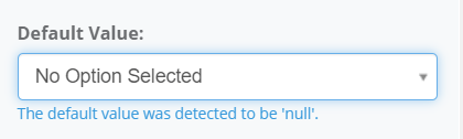
For radio button list controls, the default value will be selectable based on the values from the corresponding List Named Range that was selected.
Tooltip Type
Tooltips are informative message boxes that are displayed when you mouse-over or click on a control. The Tooltip Type property determines the message style, and when the information will be shown.
- Tooltip: The content will appear in a small bubble when the user enters focus on the target input by moving their mouse over the control.
- Popover: The content will appear in a pop-up box when the user clicks on the target input.

Tooltip Content
This property accepts the special {FriendlyName} tag if you want to insert the value of the Name property of this control into the tooltip.

Tooltip
The Tooltip Content property determines the information that will appear in the tooltip bubble.
Popover
The Tooltip Content property determines the information that will appear in the popover message.

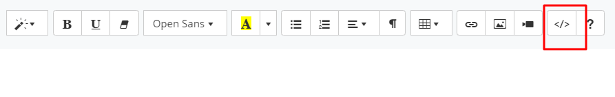
Clicking on the Edit Content button will launch an instance of a rich-text editor that supports HTML code. The editor includes a simple menu for inserting certain control sets such as tables, lists, images, videos, and links, as well as text formatting controls, such as boldness, highlighting, and font.
Modifying the HTML Content
Clicking on the HTML (</>) button will change the the editor to HTML-mode. In this mode, you can enter your own HTML code, including references to classes that are defined in the Stylesheets module. Click the ‘X’ button in the right corner to close this window and save your changes.
Styles that are defined in the Stylesheets module will not be visible in the User Interface Designer view of the application. These stylesheets are only loaded during the Preview and Published versions of the application.
Note that scripts that are injected into the HTML will be stripped from the contents control.
Dynamic Content Injection
The value of calculated, and input named ranges can be injected directly into the HTML contents of the popover.

All dynamically injected variables must be entered inside double curly braces – {{ }}. To inject a variable into the contents, begin by entering double curly braces, and the system will automatically display available fields.
Single Named Ranges
When you enter double curly braces, you will see a list of Single Named Ranges (SNR). Selecting one of these from the list will populate the name of the named range in the contents.

Several formatting options are available when injecting the value of a Single Named Range (SNR). To use any of the formatting options, simply type in a colon character (:) after the name to see a list of supported data types. If you don’t apply any formatting, the name will be injected as an unformatted value.

The data types (Integer, Decimal, DateTime, or Text) are necessary to determine the format of the field. The system will automatically format the value of the Single Named Range (SNR) when you select a data type. The text data type will get the formatted value directly from the calculation engine. Text data type also has an optional paramater (None) for formatting that has no effect on the output.
Upon selecting the data type, add a semicolon character (;) to begin defining the desired format for the output value. The .NET formatting standards apply to this property as outlined below.
- Standard Numeric Formatting
- Custom Numeric Formatting
- Standard Date and Time Formatting
- Custom Date and Time Formatting
Below are some examples.
{{NamedRangeName:Decimal;C2}}
- When NamedRangeName = 12, the formatted value will be $12.00.
- When NamedRangeName = 1.2345561, the formatted value will appear $1.23.
- When NamedRangeName = ‘ABC’, the formatted value will appear blank.
{{NamedRangeName:Decimal;P3}}
- When NamedRangeName = 0.12, the formatted value will be 12.000%.
- When NamedRangeName = 1.2345561, the formatted value will appear 123.457%.
- When NamedRangeName = ‘ABC’, the formatted value will appear blank.
{{NamedRangeName:Decimal;00000}}
- When NamedRangeName = 1234.5678, the formatted value will be 01235.
- When NamedRangeName = 1.2345561, the formatted value will appear 00001.
- When NamedRangeName = ‘ABC’, the formatted value will appear blank.
Predefined Formats
In addition to manual format setting you may also use one of the predefined Numeric or Date and Time Formatting:
Integer (Input value: 1234)
- {{ValueInteger:Integer;00}} => 1234
- {{ValueInteger:Integer;#,##0}} => 1,234
- {{ValueInteger:Integer;00000}} => 01234
- {{ValueInteger:Integer;##-##}} => 12-34
Decimal (Input value: 123456.78)
- {{ValueDecimal:Decimal;0.0}} => 123456.8
- {{ValueDecimal:Decimal;0.00}} => 123456.78
- {{ValueDecimal:Decimal;#,##0.0}} => 123,456.8
- {{ValueDecimal:Decimal;#,##0.00}} => 123,456.78
- {{ValueDecimal:Decimal;0.##}} => 123456.78
- {{ValueDecimal:Decimal;00.00}} => 123456.78
- {{ValueDecimal:Decimal;0,0.00}} => 123,456.78
- {{ValueDecimal:Decimal;0%}} => 12345678%
- {{ValueDecimal:Decimal;0.0%}} => 12345678.0%
Datetime (Input value: 12/05/2018 11:25:07 pm)
- {{NamedRangeName:Datetime;yyyy}} => 2018
- {{NamedRangeName:Datetime;MM}} => 12
- {{NamedRangeName:Datetime;dd}} => 05
- {{NamedRangeName:Datetime;yyyy/MM/dd}} => 2018/12/05
- {{NamedRangeName:Datetime;MM/dd/yyyy}} => 12/05/2018
- {{NamedRangeName:Datetime;dd/MM/yyyy}} => 05/12/2018
- {{NamedRangeName:Datetime;HH}} => 23
- {{NamedRangeName:Datetime;mm}} => 25
- {{NamedRangeName:Datetime;ss}} => 07
- {{NamedRangeName:Datetime;tt}} => PM
- {{NamedRangeName:Datetime;HH:mm tt}} => 23:25 PM
- {{NamedRangeName:Datetime;HH:mm:ss tt}} => 23:25:07 PM
Text
- {{NamedRangeName:Text;None}} : None is an optional parameter
- {{NamedRangeName:Text}} : Will work the same as above
Tooltip Position
The Tooltip Position property determines where the tooltip or popover will be positioned in respect to the target input.

If Auto is selected, the tooltip or popover position will be calculated automatically based on other parameters like the position of the target input, and content of the tooltip or popover.
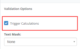
Trigger Calculations
If Trigger Calculations is selected, changing the value in this input control will trigger a calculation. Calculations perform a server call with all of the inputs from the user interface and populate the output controls with the values from the updated calculation.
In workbooks with complex calculations, enabling calculations may lead to delays in the user experience. The best practice when determining whether an input should trigger calculations should take into account the following factors:
- Does this input affect any calculated values? If the field is simply informational, then there is no reason to trigger a calculation.
- Does this input affect my user interface? If the field can change the visibility or enabled-ness of pages or other controls, then it is a good idea to trigger calculations when changes occur to the input.
- Will something else trigger calculations before this input is relevant? If the user won’t see the results of the calculations until reaching a different page, then you can hold off on triggering calculations until a button press or a different control’s value is changed.
Validation Trigger
The Validation Trigger selection will indicate the events that will cause the validation rules to be processed against the control. Validation constitutes any of the other validation options, such as Required and Minimum/Maximum Length. If validation fails (e.g. input is required but no entry exists), then the request calculation will be skipped.

You can select multiple events to trigger validation. The following triggers are available:
- After Change – As soon as the value in the control is changed.
- Before Calculate – Before any calculation event is triggered. This could include navigation or button clicks, as well as any other control triggering calculations. It has the ability to cancel the calculation action when failed.
- Before Navigate – Before any navigation event is triggered. This could include navigation via user clicking a page in the navigation bar or a button-trigger navigation action. It has the ability to cancel the subsequent action when failed.
- Before Save – Only before a save action is triggered. It has the ability to cancel the subsequent action when failed.
Required
Indicates whether the textbox field is required during validation.
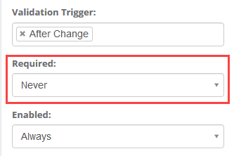
This can be configured as Always or Never to indicate whether the input is statically required or not.
Alternatively, if any Boolean Single Named Ranges (SNR) exist (i.e. ranges pointing to a single cell that evaluates to TRUE or FALSE), then the required-ness of the input can be configured to reflect the value of that named range using the ‘By Value Of’ setting.
Enabled
Indicates whether the textbox field is enabled.

This can be configured as Always or Never to indicate whether the input is statically enabled or not.
Alternatively, if any Boolean Single Named Ranges (SNR) exist (i.e. ranges pointing to a single cell that evaluates to TRUE or FALSE), then the enabled-ness of the input can be configured to reflect the value of that named range using the ‘By Value Of’ setting.
Visible
Indicates whether the textbox field is visible.
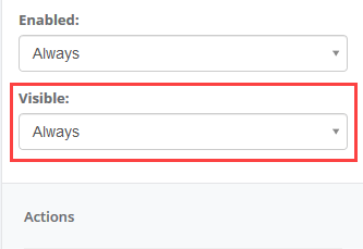
This can be configured as Always or Never to indicate whether the input is statically visible or not.
Alternatively, if any Boolean Single Named Ranges (SNR) exist (i.e. ranges pointing to a single cell that evaluates to TRUE or FALSE), then the visibility of the input can be configured to reflect the value of that named range using the ‘By Value Of’ setting.