Search Knowledge Base by Keyword
Maps
Overview
From city maps to regions, SpreadsheetWEB features several types of geographical maps you can use to visualize your data in Dashboard applications. Below is an overview of each map type.
Continuous Cartogram
Bored of the painstakingly dull looks of traditional maps? Continuous cartogram can help easily identify the big outliers in a dataset, while giving a unique look to your maps. A continuous cartogram plots two measures on a map by scaling the land borders depending on the first measure selected, and then coloring the areas by the second measure. Available are region, country and states maps. The column containing area names should be selected in the Label Field. The areas will be shaped based on the magnitude selected for the Measure Field. Color Field adds the second dimension, showing this second measure on the nodes by highlighting them appropriately, and adding a color legend. Please note that the Measure Field and Color Field need to contain numeric fields and remember to select an Expression for each of these fields by choosing from the drop down.

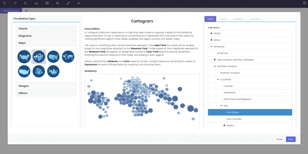
Cartogram
A Cartogram plots two measures on a map that uses circles or squares, instead of the traditional regional borders. On top of allowing for comparing two magnitudes, this map type is also useful for making significant regions more visible. Available are region, country and states maps. The column containing area names should be selected in the Label Field. The areas will be shaped based on the magnitude selected for the Measure Field. Circles based on the magnitude selected for the Measure Field will appear on designated locations. Color Field adds the second dimension, showing this second measure on the nodes and adding a color legend. Please note that the Measure and Colorneed to contain numeric fields and remember to select an Expression for each of these fields by choosing from the drop down.
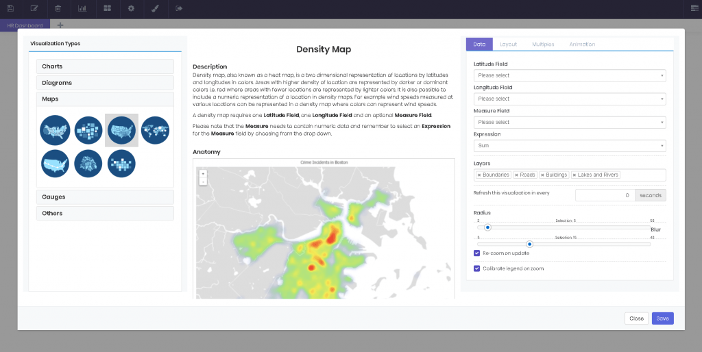
Density Map
Density map, also known as a heat map, is a two dimensional representation of locations by latitudes and longitudes in colors. Areas with higher density of location are represented by darker or dominant colors i.e. red where areas with fewer locations are represented by lighter colors. It is also possible to include a numeric representation of a location in density maps. For example wind speeds measured at various locations can be represented in a density map where colors can represent wind speeds. A density map requires one Latitude Field, one Longitude Field and an optional Measure Field. Please note that the Measure needs to contain numeric data and remember to select an Expression for the Measure field by choosing from the drop down.
Location Map
A location map is very similar to a standard map, but instead of shading regions, it utilizes a coordinate system using longitude and latitudes, and displays magnitudes with circles of varying radii. Groups are separated by color. The columns containing location coordinates should be selected in the Latitude Field and Longitude Field. Circles based on the magnitude selected for the Measure Fieldwill appear on designated locations. Please note that the Measure needs to contain numeric fields and remember to select an Expression for the Measure field by clicking on the field first and then choosing from the drop down

Route Map
Want to plot your next road-trip or hurricane routes in the Caribbean? Then this map type is for you. The columns containing location coordinates should be selected in the Latitude Field and Longitude Field. The column containing data that determines how the coordinates will be paired needs to be selected for the Group Field. Finally, the data that will determine the order of the coordinates visited should be selected in the Order Field. Please note that this column needs to be either numeric or date data.

Standard Map
A standard map shades regions based on a measure input. Available are region, country and even city maps. The column containing area names should be selected in the Label Field. The areas will be highlighted based on the magnitude selected for the Measure Field. Please note that the Measureneeds to contain numeric fields and remember to select an Expression for the Measure Field by clicking on the field first and then choosing from the drop down.

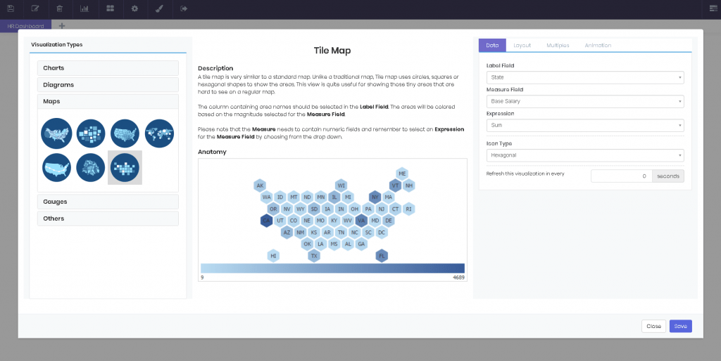
Tile Map
A tile map is very similar to a standard map. Unlike a traditional map, Tile map uses circles, squares or hexagonal shapes to show the areas. This view is quite useful for showing those tiny areas that are hard to see on a regular map. The column containing area names should be selected in the Label Field. The areas will be colored based on the magnitude selected for the Measure Field. Please note that the Measure needs to contain numeric fields and remember to select an Expression for the Measure Field by choosing from the drop down.