Search Knowledge Base by Keyword
-
App Creation
-
- Creating a Designer Application
- User Interface
- Pages and Navigation
- Database
- Print Process
- Email Process
- Excel Export
- Stylesheets
- Custom Actions
- Text Resource (Run-time) Editor
- Queries
- Goal Seek Event
- Solver Event
- Application
-
- Sections
- Containers
- Textbox
- Checkbox
- Dropdown
- Radio Button
- Calendar
- File Upload
- Input Grids
- Slider
- Content
- Output Grid
- Charts
- Maps
- Gauges
- Action Button
- Show all articles ( 1 ) Collapse Articles
-
-
App Management
-
Data Management
-
Users and Teams
-
Developers
-
-
- GetDocumentStubs (Application-Level)
- GetRecordExtended (Application-Level)
- GetRecord (Application-Level)
- GetBatchResults (Application-Level)
- GetResult (Application-Level)
- CloseDedicatedSession (Application-Level)
- OpenDedicatedSession (Application-Level)
- SendEmail (Application-Level)
- GenerateDocument (Application-Level)
- MergeDocumentsExtended (Application-Level)
- MergeDocuments (Application-Level)
- DeleteUser (Site-Level)
- UpdateUser (Site-Level)
- CreateUser (Site-Level)
-
-
-
Administration
-
Changelog
- Version 6.27
- Version 6.26
- Version 6.25
- Version 6.24
- Version 6.23
- Version 6.22
- Version 6.21
- Version 6.20
- Version 6.19
- Version 6.18
- Version 6.17
- Version 6.16
- Version 6.15
- Version 6.14
- Version 6.13
- Version 6.12
- Version 6.11
- Version 6.10
- Version 6.9
- Version 6.8
- Version 6.7
- Version 6.6
- Version 6.5
- Version 6.4
- Version 6.3
- Version 6.2
- Version 6.1
- Version 6.0
- Version 5.2
- Version 5.1
- Version 5.0
- Version 4.8
- Version 4.7
- Version 4.6
- Version 4.5
- Version 4.4
- Version 4.3
- Version 4.2
- Version 4.1
- Version 4.0
- Version 3.5
- Version 3.4
- Version 3.3
- Version 3.2
- Version 3.1
- Version 3.0
- Version 2.5
- Version 2.4
- Version 2.3
- Version 2.2
- Version 2.1
- Version 2.0
- Version 1.6
- Version 1.5
- Version 1.4
- Version 1.3
- Version 1.2
- Version 1.1
- Version 1.0
- Show all articles ( 44 ) Collapse Articles
-
Other Features
-
Connectors
-
Integrations
Grid, Pivot Table, and Text Controls
Overview
Grids, pivot tables, and text content fields create the dashboard other components. These elements are used for displaying data in a table format, and adding any type of text or image into your dashboard applications.
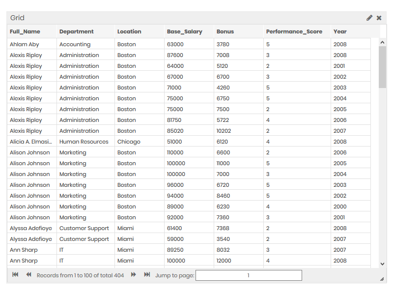
Grid
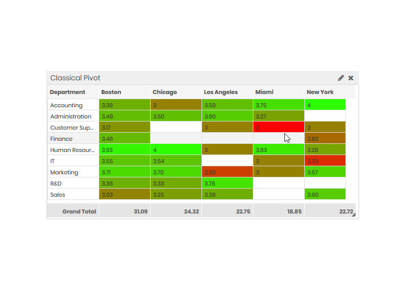
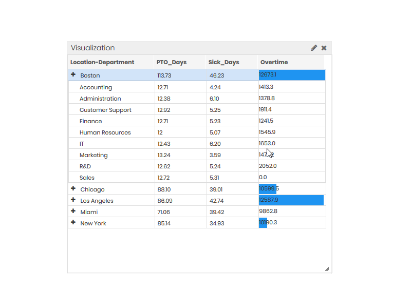
Pivot Table
Tree pivots use only Row and Measure fields. If you select more than one input for either the Row or Measure, the table will add buttons to allow for expanding the rows. The hierarchy will be formed based on the order you add the data to the Row and Measure fields.
Classical pivot tables accept one Column field and any number of Row and Data fields. If you select more than one input for either the Row or Data, the table will add buttons to allow for expanding the rows. The hierarchy will be formed based on the order you add the data to the Row and Column fields.
With both table styles, you can also select an Expression, assign Conditional Formatting, modify the Titles, or change number Formatting for the Measurefields by clicking the corresponding selected fields.
|
Classical Pivot
|
Tree Pivot
|
|---|---|
 |
 |
Text
Text modules help add labels like headlines, explanations, or other text fields into your dashboards. The Content section provides a simple text editor where you can enter and configure the text to be displayed.
The Layout tab contains options for customizing the Background Color, Border Color, Border Thickness, and Border Type properties. These settings will affect the text area box.


