Search Knowledge Base by Keyword
-
App Creation
-
- Creating a Designer Application
- User Interface
- Pages and Navigation
- Database
- Print Process
- Email Process
- Excel Export
- Stylesheets
- Custom Actions
- Text Resource (Run-time) Editor
- Queries
- Goal Seek Event
- Solver Event
- Application
-
- Sections
- Containers
- Textbox
- Checkbox
- Dropdown
- Radio Button
- Calendar
- File Upload
- Input Grids
- Slider
- Content
- Output Grid
- Charts
- Maps
- Gauges
- Action Button
- Show all articles ( 1 ) Collapse Articles
-
-
App Management
-
Data Management
-
Users and Teams
-
Developers
-
-
- GetDocumentStubs (Application-Level)
- GetRecordExtended (Application-Level)
- GetRecord (Application-Level)
- GetBatchResults (Application-Level)
- GetResult (Application-Level)
- CloseDedicatedSession (Application-Level)
- OpenDedicatedSession (Application-Level)
- SendEmail (Application-Level)
- GenerateDocument (Application-Level)
- MergeDocumentsExtended (Application-Level)
- MergeDocuments (Application-Level)
- DeleteUser (Site-Level)
- UpdateUser (Site-Level)
- CreateUser (Site-Level)
-
-
-
Administration
-
Changelog
- Version 6.27
- Version 6.26
- Version 6.25
- Version 6.24
- Version 6.23
- Version 6.22
- Version 6.21
- Version 6.20
- Version 6.19
- Version 6.18
- Version 6.17
- Version 6.16
- Version 6.15
- Version 6.14
- Version 6.13
- Version 6.12
- Version 6.11
- Version 6.10
- Version 6.9
- Version 6.8
- Version 6.7
- Version 6.6
- Version 6.5
- Version 6.4
- Version 6.3
- Version 6.2
- Version 6.1
- Version 6.0
- Version 5.2
- Version 5.1
- Version 5.0
- Version 4.8
- Version 4.7
- Version 4.6
- Version 4.5
- Version 4.4
- Version 4.3
- Version 4.2
- Version 4.1
- Version 4.0
- Version 3.5
- Version 3.4
- Version 3.3
- Version 3.2
- Version 3.1
- Version 3.0
- Version 2.5
- Version 2.4
- Version 2.3
- Version 2.2
- Version 2.1
- Version 2.0
- Version 1.6
- Version 1.5
- Version 1.4
- Version 1.3
- Version 1.2
- Version 1.1
- Version 1.0
- Show all articles ( 44 ) Collapse Articles
-
Other Features
-
Connectors
-
Integrations
Containers
A container is a subsection that can help subdivide a section into multiple vertical segments.
Style
You can select a Well style from the Small, Medium, or Large options. The Panel option will make the container display like Card. After selecting Panel as style, Header and Footer inputs will appear where you can enter strings to be displayed on the header and footer sections of the container.

Users can customize the actual corresponding styles using Cascading Style Sheets (CSS) in the Stylesheet Designer.
If you select the style Panel and enter any text into the Header Text field, the Container can be made Collapsible.
Collapsible
When the Collapsible property is enabled, the Panel containers can be toggle to show or collapse the Container area and all controls inside it. When you Preview or Publish the application, you can click the header name of a collapsible panel to hide or expand the entire panel.

If the Default Collapsed property is enabled, collapsible panels will be collapsed by default during run-time.
Color Style
The Color Style property sets the color style of the container.

By default, the styles match the color schemes:
- Default (Standard grey)
- Primary
- Primary 2
- Info
- Warning
- Warning 2
- Success
- Danger
Users can customize the actual corresponding styles using Cascading Style Sheets (CSS) in the Stylesheet Designer.
Visible
The Visible property sets the conditions under which the container will be visible. This can be set to Always or Never.
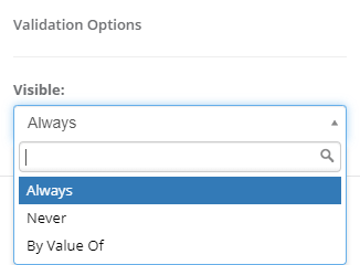
If there are any Boolean Named Ranges (BNR) defined in your workbook (i.e. single named ranges that evaluate to TRUE or FALSE), then an additional option (By Value Of) will be available. This option allows you to configure a Boolean named range that determines whether or not this section is visible. This can either be calculated or input-based.