Search Knowledge Base by Keyword
Diagrams
Overview
SpreadsheetWEB features over a dozen types of dashboard diagrams you can use to visualize your data in Dashboard applications. Below is an overview of each diagram type.
Abacus Diagram
Abacus diagram works similar to a bar chart. Magnitudes are plotted on a grid matrix and this visualization makes it easier to track how each item compare to the rest in up to two groupings. Abacus diagram requires at least one Source and one Measure data. You can add more than one data to the Measure field to create multiple series. Alternatively, you can select a Group to separate the Source data accordingly. Please note that the Measures need to contain numeric fields and remember to select an Expression for each numeric Measure field by clicking on the field first and then choosing from the drop down.

Bubble Diagram

Bullet Diagram

Bump Diagram
Please note that the Ranking needs to be a numeric field.

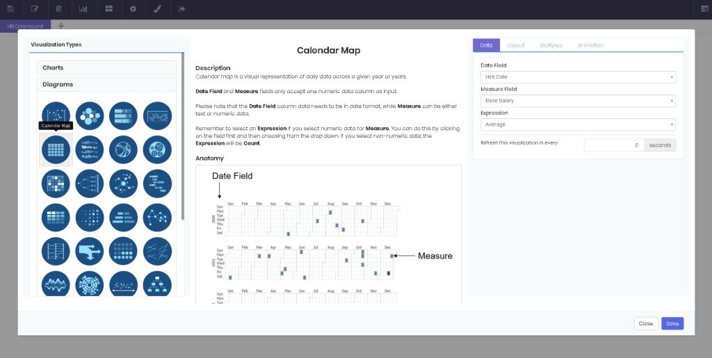
Calendar Map
Circle Clusters
Circle clusters diagram plots a dataset against a given measure. This diagram is most useful for identifying where groupings occur in the comparison measure. A circle cluster accepts only one Source, one Group Field and one Measure data. Please note that the Measure needs to contain numeric fields and remember to select an Expression for the Measure field by clicking on the field first and then choosing from the drop down.

Chord Diagram
Chord diagram represents inter-relationships in a data matrix. It does a great job at showing numerous connections at once. A wheel of points are connected with chords. Source, Target and Measure fields only accept one numeric data column as input. You can also select a Group to color the Source data accordingly. Please remember to select an Expression for data in the Measure field by selecting it first, and then choosing from the drop down.

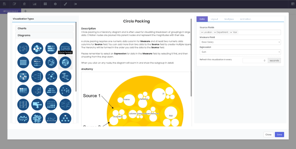
Circle Packing
Circle packing is a hierarchy diagram and is often used for visualizing breakdown of groupings in large data. Children nodes are packed into parent nodes and represent the magnitudes with their size. A circle packing requires one numeric data column for Measure and at least two numeric data columns for Source field. You can add more than two data to the Source field to create multiple layers. The hierarchy will be formed in the order you add the data to the Source field. Please remember to select an Expression for data in the Measure field by selecting it first, and then choosing from the drop down. When you click on any node, the diagram will zoom in and show the subgroup in detail.
Co-Occurence Matrix
Co-Occurrence matrix shows the distribution of co-occurring values in a dataset. For instance, this diagram can easily reveal the interactions of a group of people. Source, Target and Measure fields only accept one numeric data column as input. This diagram also counts the times the source and target values meet and shows this measure on intersections. Please remember to select an Expression for data in the Measure field by selecting it first, and then choosing from the drop down.

Dendrogram
Dendrogram is a hierarchy diagram that shows the relationship between sequentially merged classes. The data can be visualized in a linear or a radial fashion. Arcs connect the nodes of data. A dendrogram requires one Measure and at least two Source data columns for input. You can add more than two data to the Source field to create multiple layers. The hierarchy will be formed in the order you add the data to the Source field. Please remember to select an Expression for data in the Measure field by selecting it first, and then choosing from the drop down.

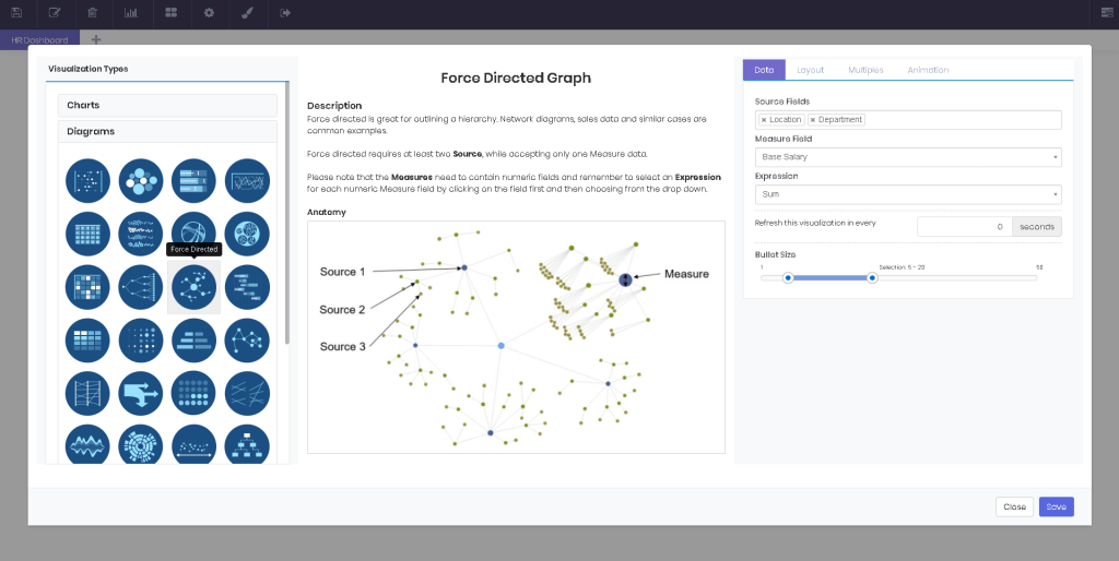
Force Directed Graph
Force directed is great for outlining a hierarchy. Network diagrams, sales data and similar cases are common examples. Force directed requires at least one Source, while accepting only one Measure data. Please note that the Measures need to contain numeric fields and remember to select an Expression for each numeric Measure field by clicking on the field first and then choosing from the drop down.
Gantt Diagram
Gantt diagrams are great for illustrating a project schedule. Gantt diagrams show the start and finish dates of the projects, and the percentage complete. A Gantt diagram requires at least one Task, one Start and one End data. Please note that Start and End need to be date data. Alternatively, you can select a Group to separate the Task data accordingly.

Heatmap
Heatmap represents data in matrix format with added color coding, to signify corresponding magnitudes. Working pretty much like a pivot table, a heatmap accepts one Row Field, one Column Field and one Measure data columns for input. Remember to select an Expression if you select numeric data for Measure. You can do this by clicking on the field first and then choosing from the drop down. If you select non-numeric data, the expression will be Count.

Matrix Diagram
A matrix diagram is great for comparing three different variables at the same time. Circles are positioned on the diagram as they correlate to the X and Y axis variables and the variable is represented through the size of the circle. A matrix diagram accepts one Row Field, one Column Field and one Measure data columns for input. Remember to select an Expression for Measure. You can do this by clicking on the field first and then choosing from the drop down. If you select non-numeric data, the Expression will be Count.

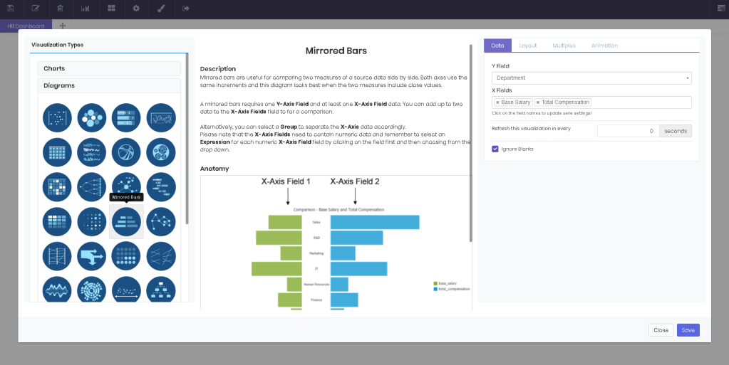
Mirrored Bars
Mirrored bars are useful for comparing two measures of a source data side by side. Both axes use the same increments and this diagram looks best when the two measures include close values. A mirrored bars diagram requires one Source and two Measure data. Please note that the Measure fields need to contain numeric data and remember to select an Expression for each numeric Measure field by clicking on the field first and then choosing from the drop down.
Network Diagram
Network diagram is most useful if a one-way relationship between the elements exists. For example, it can be used to graph the number of students assigned to a faculty member. Network diagram only accepts one data column for Source, Target, Relation Field and Measure fields. Please note that the Measures need to contain numeric fields and remember to select an Expression for each numeric Measure field by clicking on the field first and then choosing from the drop down.

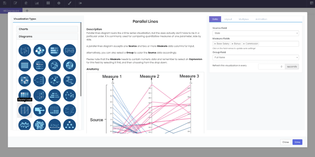
Parallel Lines
Parallel lines diagram looks like a time series visualization, but the axes actually don’t have to be in a particular order. It is commonly used for comparing quantitative measures of one parameter, side by side. A parallel lines diagram accepts one Source and two or more Measure data columns for input. Alternatively, you can also select a Group to color the Source data accordingly. Please note that the Measure needs to contain numeric data and remember to select an Expression for this field by selecting it first, and then choosing from the drop down.
Sankey Diagram
Sankey diagram represents a flow of a measure between two or more dimensions. It’s often used for visualizing a distribution of reSources or cash flow. Sankey diagram accepts one Measure and two or more Source data columns for input. The columns selected for Source will be placed from left to right, in the order they are selected. Please note that the Measure needs to contain numeric data and remember to select an Expression for this field by selecting it first, and then choosing from the drop down.

Seat Map
Seating arrangements or organization charts are where the seat map shines. This diagram comes in Linear and Radial flavors. The first looks great when visualizing a hierarchy or distribution, while the latter literally shows the composition of items, in a theater seating format. A seat map accepts one Group and one Source data. Sourcefield can contain numeric or text data. This diagram doesn’t apply any expression to numeric data.

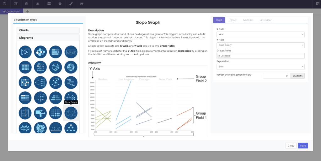
Slope Graph
Slope graph compares the trend of one field against two groups. This diagram only displays an A to B relation; the points in between are not relevant. This diagram is fairly similar to a line multiples with an emphasis on the start and end points. A slope graph accepts one X-Axis, one Y-Axis and up to two Group Fields. If you select numeric data for the Y-Axis field, please remember to select an Expression by clicking on the field first and then choosing from the drop down.
Streamgraph
Streamgraph is a variation of stacked area chart, displaced around a central axis with smooth lines. A streamgraph accepts one X-Axis Field, one Group Field and one Measure data column for input. Please note that the X-Axis Field and Measure need to contain numeric data and remember to select an Expression for the Measure field by selecting it first, and then choosing from the drop down.

Sunburst Diagram
Sunburst diagram is essentially a variation of pie chart. While pie chart has only one dimension representing the size of each pie, sunburst diagram has multiple numeric fields each representing a ring around the previous one. A sunburst diagram accepts one Measure and two or more Sourcedata columns for input. The hierarchy will be formed in the order you add the data to the Sourcefield. Please note that the Measure needs to contain a numeric field and remember to select an Expression for this field by selecting it first, and then choosing from the drop down.

Timeline Diagram
A timeline is a graphical way of displaying a list of events in chronological order. A timeline requires at least one Source and one Start Date data. Without an End Date, it will work pretty much like a calendar map. Alternatively, you can select a Group to separate the Source data accordingly.

Treemap
Treemap is a diagram that visualizes hierarchical data in form of nested rectangles. The size of the rectangles represent quantity, while the color code helps compare the magnitudes within each group. A treemap accepts any number of Source fields and one Measure field for input. The hierarchy will be formed in the order you add the data to the Source field. Measure determines the size of the rectangles. Please note that the Measure field needs to contain numeric fields and remember to select an Expression for the Measure data by selecting it first, and then choosing from the drop down.

Word Cloud
Word cloud represents text data visually. It is commonly used to analyze long texts or survey answers. Word cloud requires only one Source data column. The words will be sized depending on how many times they repeat in the data. You can also make the diagram Exclude Stop Words, such as “and, or, but”. Simply check this option in the Layout tab.
