Search Knowledge Base by Keyword
Charts
Overview
SpreadsheetWEB features about a dozen types of dashboard charts you can use to visualize your data in Dashboard applications. Below is an overview of each chart type.
Area Chart
Area charts are most commonly used for visualizing cumulative totals of quantities over a period of time. An area chart requires at least one X Field and one Y Field(s) data. You can add more than one data to the Y Field(s) to create multiple series. Alternatively, you can select a Group to separate the Y Field(s) data accordingly. Please note that the Y Field(s) needs to contain numeric fields and remember to select an Expression for each numeric Y Field by clicking on the selected field(s) and then choosing from the drop down.

Bar Chart
Bar charts can be used to show cumulative totals or change over time, as well as qualitative (features, properties) data. Bar charts are horizontal, whereas column charts are vertical. A bar chart requires at least one Y Axis and one X Axis data. You can add more than one data to the X Axis field to create multiple series. Alternatively, you can select a Group to separate the X Axis data accordingly. Please note that the X Axis needs to contain numeric fields and remember to select an Expression for each numeric X Axis field by clicking on the field first and then choosing from the drop down. Bar charts are Stacked by default. To “unstack” it, select the None variable in the Stack Type dropdown.

Bubble Chart
A bubble chart works similarly to a scatter chart with the exception of featuring a third variable. The size of the data points visualize this third attribute. A bubble chart requires at least one X Axis Field, one Y Axis Field and one Size Field. You can add more than one data to the Y Axis Field to create multiple series. Alternatively, you can select a Group to separate the Y Axis data accordingly. Please note that X Axis Field, Y Axis Field and Size Field need to contain numeric fields and remember to select an Expression for Y Axis Field and Size Field by clicking on the field first and then choosing from the drop down.

Column Chart
Column charts can be used to show cumulative totals or change over time, as well as qualitative (features, properties) data. Column charts are vertical, whereas bar charts are horizontal. A column chart requires at least one X Axis and one Y Axis data. You can add more than one data to the Y Axis field to create multiple series. Alternatively, you can select a Group to separate the Y Axis data accordingly. Please note that the Y Axis needs to contain numeric fields and remember to select an Expression for each numeric Y Axis field by clicking on the field first and then choosing from the drop down. Column charts are Stacked by default. To “unstack” it, select the None variable in the Stack Type dropdown.

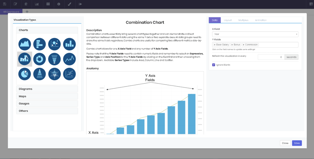
Combination Chart
Combination charts essentially bring several chart types together and can demonstrate a direct comparison between different data using the same Y axis or two separate axes. All data groups need to share the same X axis regardless. Combo charts are useful for comparing two different metrics side-by-side. Combo chart allows for one X Axis Field and any number of Y Axis Fields. Please note that the Y Axis Fields need to contain numeric fields and remember to select an Expression, Series Type and Axis Position for the Y Axis Fields by clicking on the field first and then choosing from the drop down. Available Series Types include Area, Column, Line and Scatter. Please note that there should be at least one left aligned axis and one right aligned axis!
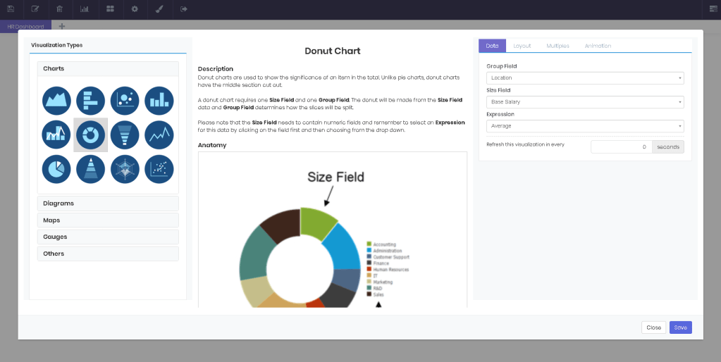
Donut Chart
Donut charts are used to show the significance of an item in the total. Unlike pie charts, donut charts have the middle section cut out. A donut chart requires one Size Field and one Group Field. The donut will be made from the Size Field data and Group Field determines how the slices will be split. Please note that the Size Field needs to contain numeric fields and remember to select an Expression for this data by clicking on the field first and then choosing from the drop down.
Funnel Chart
Funnel charts are used to show how much an item contributes to the whole. Funnel chart looks like an upside down pyramid chart. A funnel chart requires one Size Field and one Group Field. The funnel will be made from the Size Field data and Group Field determines how the levels will be split. Please note that the Size Field needs to contain numeric fields and remember to select an Expression for this data by clicking on the field first and then choosing from the drop down.

Line Chart
A staple in data visualization, Line charts are most commonly used for showing trends, or a change over time. A line chart requires at least one X Axis and one Y Axis data. You can add more than one data to the Y Axis field to create multiple series. Alternatively, you can select a Group to separate the Y Axis data accordingly. Please note that the Y Axis needs to contain numeric fields and remember to select an Expression for each numeric Y Axis field by clicking on the field first and then choosing from the drop down.

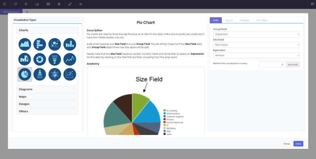
Pie Chart
Pie charts are used to show the significance of an item in the total. Unlike donut charts, pie charts don’t have the middle section cut out. A pie chart requires one Size Field and one Group Field. The pie will be made from the Size Field data and Group Field determines how the slices will be split. Please note that the Size Field needs to contain numeric fields and remember to select an Expression for this data by clicking on the field first and then choosing from the drop down.
Pyramid Chart
Pyramid charts are used to show how much an item contributes to the whole. Pyramid chart looks like an upside down funnel chart. A pyramid chart requires one Size Field and one Group Field. The pyramid will be made from the Size Field data and Group Field determines how the levels will be split. Please note that the Size Field needs to contain numeric fields and remember to select an Expression for this data by clicking on the field first and then choosing from the drop down.

Radar Chart
Plotting various stats against each other, Radar charts are often used to compare multiple items at a single point. A radar chart requires one X Axis and one Y Axis data. You can add more than one data to the Y Axis field to create multiple series. Alternatively, you can select a Group to separate the Y Axis data accordingly. Please note that the Y Axis needs to contain numeric fields and remember to select an Expression for each numeric Y Axis field by clicking on the field first and then choosing from the drop down.

Scatter Chart
Scatter charts are often used for visualizing data with lots of elements or when the data intervals are inconsistent. A scatter chart requires at least one X Axis and one Y Axis data. You can add more than one data to the Y Axis field to create multiple series. Alternatively, you can select a Group to separate the Y Axis data accordingly. Please note that the Y Axis needs to contain numeric fields and remember to select an Expression for each numeric Y Axis field by clicking on the field first and then choosing from the drop down.
