Simple Label
Simple Label Control in SpreadsheetWeb Designer
The Simple Label control in SpreadsheetWeb Designer allows you to display formatted text, structured markup, and dynamic data from Excel in your web applications. This powerful UI component supports headings, lists, alerts, images, tables, and more, making it easy to create clean, user-friendly interfaces without writing code.
This control is ideal for:
- Section titles and headers
- User instructions and descriptions
- Grouping related inputs
- Displaying calculated outputs or summaries
- Enhancing the overall UI/UX of your application
Dynamic Content Support with Named Ranges
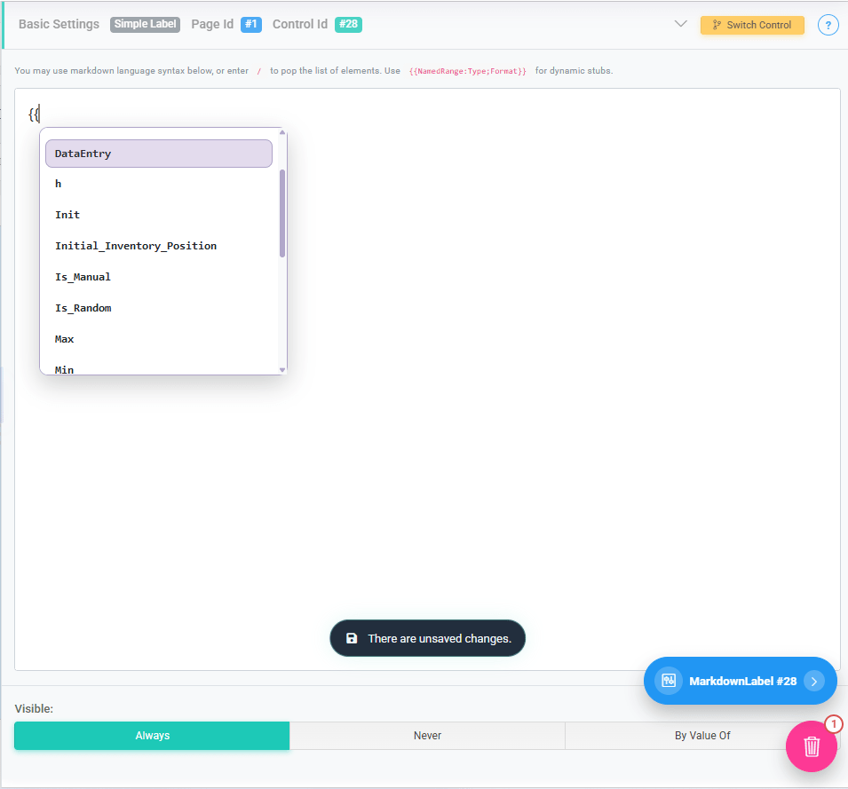
The Simple Label control supports dynamic content by referencing named ranges from your Excel file.
To insert a dynamic value, use double curly brackets:
{{NamedRange}}When typing {{, the Designer will automatically display a list of available named ranges for selection.
This allows you to:
- Display calculated results inline with text
- Show user-specific or context-specific values
- Combine static text with dynamic outputs
Example: Total Premium: {{TotalPremium}}
At runtime, the control will render the value of the TotalPremium named range.
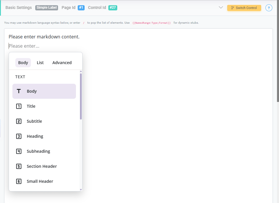
Text and Formatting Options
These options define how the text is styled and presented:
- Body: Standard paragraph text used for general descriptions or instructions.
- Title: The highest-level heading, typically used for the main title of a page or section.
- Subtitle: A secondary heading that supports the main title.
- Heading: A prominent section heading used to organize major parts of the interface.
- Subheading: A smaller heading used within sections for additional structure.
- Section Header: Used to clearly separate logical sections within a page.
- Small Header: A subtle header for minor sections or grouped elements.
- Quote: Displays text in a stylized quote format, often used for emphasis or notes.
- Divider: A horizontal separator used to visually break content into sections.
Creating List and Structured Content
These options allow you to present structured lists:
- Bullet List: Displays an unordered list of items.
- Ordered List: Displays a numbered list, useful for step-by-step instructions.
- Task List: Displays a checklist-style list, typically used for tasks or requirements.
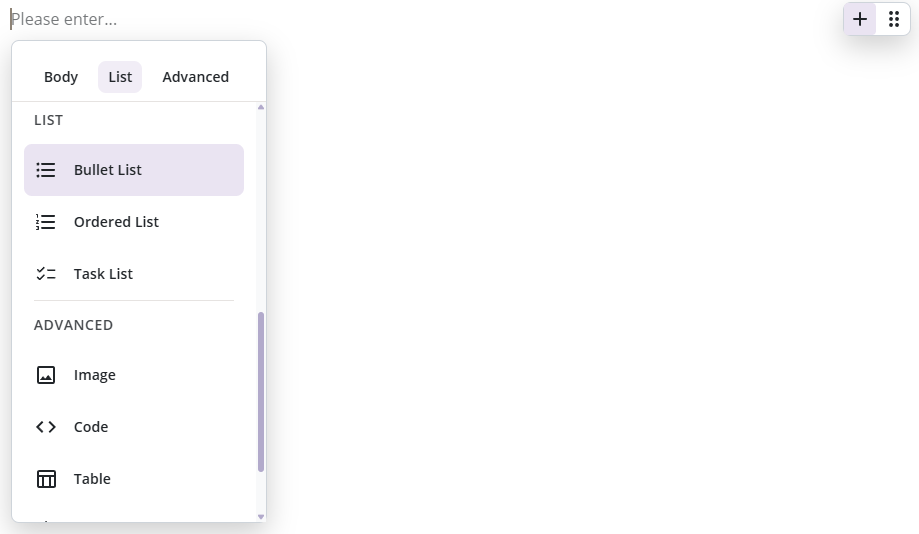
Advanced Content Features
The Simple Label control also supports richer content elements:
- Image: Displays an image within the application. Useful for branding, diagrams, or visual guidance.
- Code: Formats text as a code block, ideal for technical instructions or examples.
- Table: Displays structured tabular data for better readability of grouped information.
- Alert: Highlights important messages such as warnings, tips, or notifications.
- Carousel: Displays multiple pieces of content (such as images or text) in a rotating or scrollable format.
