Layout & Controls
Build application pages in SpreadsheetWeb Designer with the Design Library, control toolbar, Properties panel, Pages drawer, and guided workbook connections.
The Layout & Controls module is the visual workspace for building each page of a Designer application. Start with a ready-made design or add individual controls, then configure the layout and workbook connections without leaving the canvas.
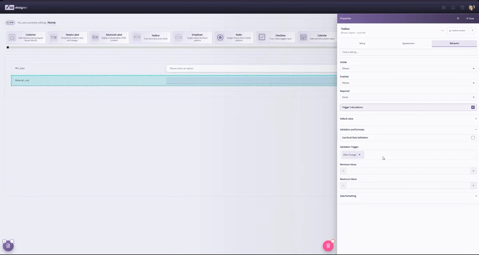
Workspace areas
- Control toolbar: Use the controls across the top of the workspace to add sections, containers, input controls, output controls, and other page elements. Select More to browse the complete control list.
- Staging Area: Build the page in the central canvas. Input and output controls must be placed inside a container, and containers must be placed inside a section. A new section includes a container by default.
- Properties panel: The panel remains available on the right and updates when you select a page element. Its tabs group related settings, including Setup, Appearance, and Behavior. The exact tabs and fields depend on the selected control.
- Page overview: Open Overview to access Quick Add, the Design Library, reusable components, application appearance tools, Preview app, and Workbook connections.
- Pages drawer: Use the page control in the lower-left corner to switch pages, manage their order, or open a page's settings without leaving Layout & Controls.
Start with a design
Open Overview, then select Design library to browse complete flows or individual pages. Use Add component to insert a reusable group of rows into the current page. Search by purpose, compare desktop, tablet, and phone previews, and review placement and appearance choices before importing.
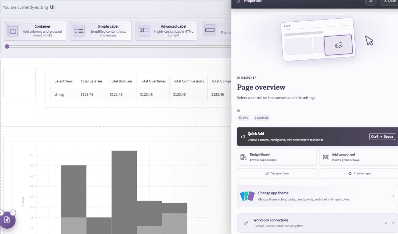
See Build an Application with the Design Library for the complete workflow. Imported designs still need connections to your workbook. Selected theme, font, and background suggestions apply to every page in the application, so review their scope before importing into an existing design.
Change application appearance
To change the application-wide backdrop, open Overview → Change app theme → Backgrounds. Choose gallery artwork, a solid color, the theme default, or an uploaded image, then select Save app theme. See Application Backgrounds for accents, animated artwork, and image-upload requirements.
Add and arrange controls
Drag a control from the toolbar into a valid container. The canvas previews the placement while you drag. You can also select an existing control and move, resize, duplicate, cut, copy, or delete it.
When moving or copying a control, the Designer shows status information and offers Go to and Cancel actions. When you paste, choose whether to place the copied control inside a compatible element or after the selected element. This makes the destination explicit and helps avoid accidental changes to the page structure.
For a faster workbook-first workflow, use Quick Add to create a control and bind it to a relevant named range without leaving the canvas.
Use Elements when you prefer to select workbook cells and generate interface elements from them. These tools can be combined with library designs and manual additions.
Configure a control
Select a control to display its settings in the Properties panel. Use the available tabs to configure its data binding, label, appearance, validation, visibility, enabled state, and control-specific behavior.
Input controls normally require a workbook named range. Formula-based ranges and ranges already assigned to incompatible controls may be unavailable. Preview the page after changing a binding or behavior that affects calculations.
For a guided review across the application's pages, open Overview and expand Workbook connections. It helps you address bindings, visibility, labels, and navigation. You can pause the guided work, edit the layout, and return later. A ready connection status does not replace testing calculations and application behavior in Preview.
Switch pages
Only one page is edited at a time. Open the Pages drawer in the lower-left corner and select a page to see its actions. Choose Design page to work on its controls, or Edit settings to configure its name, layout, and navigation. You can also click the selected page again to open it.
Use Add New Page to create another page and drag a page's reorder handle to change its position. Other actions depend on the page, including duplication, deletion, and setting the Home page. See Pages and Navigation for details and runtime navigation settings.
In Edit settings, use Layout for desktop and mobile navigation placement, Appearances for navigation, wizard, and loading treatments, and Animation for transitions into the page. Compare the themed previews before applying a choice, and use Apply to all only when that setting should be shared across pages. See Navigation appearance and Page transitions.
Classic View
Earlier Designer versions offered Classic View, with a left-side control menu. Older videos and screenshots may show that interface. The instructions above describe the current Designer, which uses the top control toolbar, Page overview, and the lower-left Pages drawer.