Simple Label
Use Simple Label blocks, including Hero, Metric, Diagram, charts, alerts, and dynamic named-range content, in SpreadsheetWeb Designer applications.
Simple Label Control in SpreadsheetWeb Designer
The Simple Label control in SpreadsheetWeb Designer allows you to display formatted text, structured markup, and dynamic data from Excel in your web applications. This powerful UI component supports headings, lists, alerts, images, tables, and more, making it easy to create clean, user-friendly interfaces without writing code.
This control is ideal for:
- Section titles and headers
- User instructions and descriptions
- Grouping related inputs
- Displaying calculated outputs or summaries
- Enhancing the overall UI/UX of your application
Choose a content block
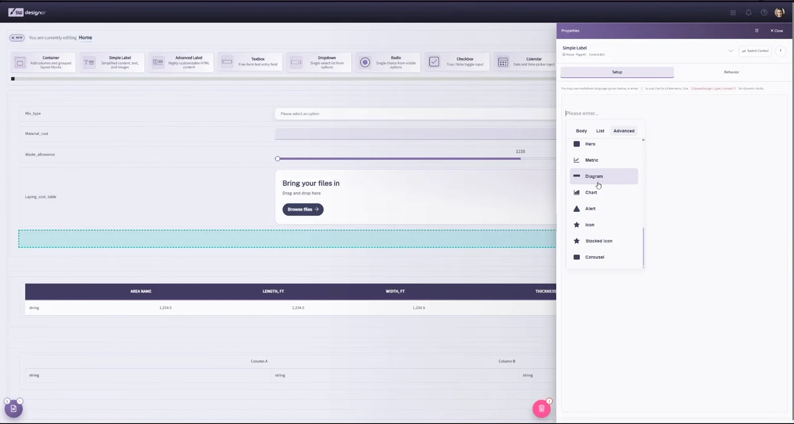
When you add or edit a Simple Label, choose the block that best matches the information you want to present. In addition to text, lists, tables, alerts, icons, charts, and carousels, the 26.9 release adds the following layouts:
- Hero: Builds a prominent introduction or callout with a title, supporting text, and visual emphasis.
- Metric: Presents a key value or KPI with a concise label and supporting context.
- Diagram: Organizes related information into a visual explanatory layout.
The block picker previews the available layouts. After choosing a block, use its editor to configure content, appearance, and any named-range values.
Dynamic Content Support with Named Ranges
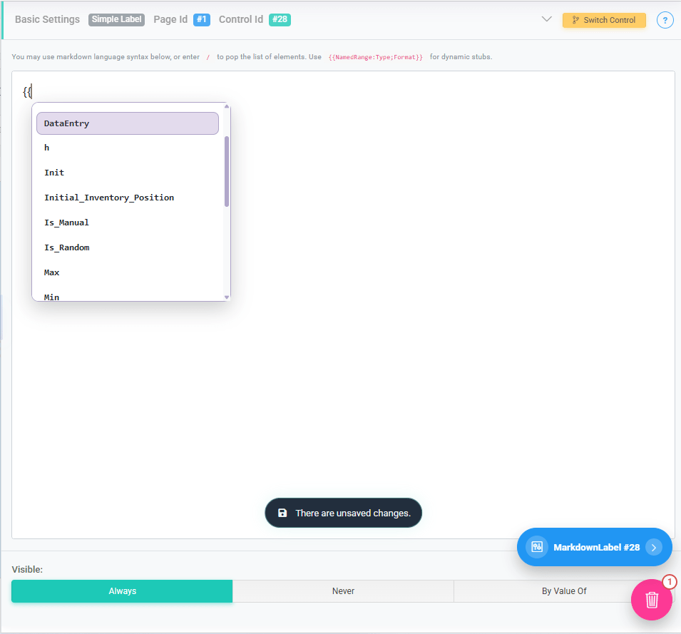
The Simple Label control supports dynamic content by referencing named ranges from your Excel file.
To insert a dynamic value, use double curly brackets:
{{NamedRange}}
When typing {{, the Designer will automatically display a list of available named ranges for selection.
This allows you to:
- Display calculated results inline with text
- Show user-specific or context-specific values
- Combine static text with dynamic outputs
Example: Total Premium: {{TotalPremium}}
At runtime, the control will render the value of the TotalPremium named range.
Text and Formatting Options
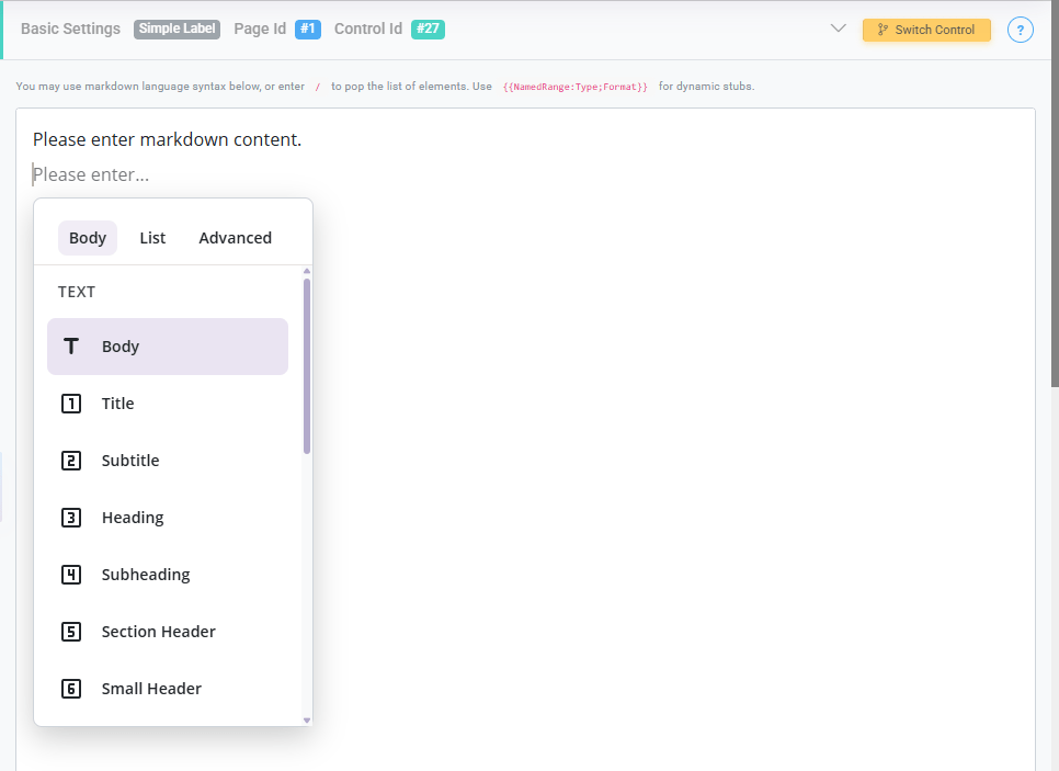
These options define how the text is styled and presented:
- Body: Standard paragraph text used for general descriptions or instructions.
- Title: The highest-level heading, typically used for the main title of a page or section.
- Subtitle: A secondary heading that supports the main title.
- Heading: A prominent section heading used to organize major parts of the interface.
- Subheading: A smaller heading used within sections for additional structure.
- Section Header: Used to clearly separate logical sections within a page.
- Small Header: A subtle header for minor sections or grouped elements.
- Quote: Displays text in a stylized quote format, often used for emphasis or notes.
- Divider: A horizontal separator used to visually break content into sections.
Creating List and Structured Content
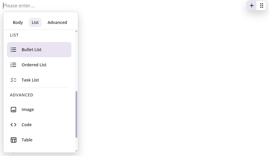
These options allow you to present structured lists:
- Bullet List: Displays an unordered list of items.
- Ordered List: Displays a numbered list, useful for step-by-step instructions.
- Task List: Displays a checklist-style list, typically used for tasks or requirements.
Advanced Content Features
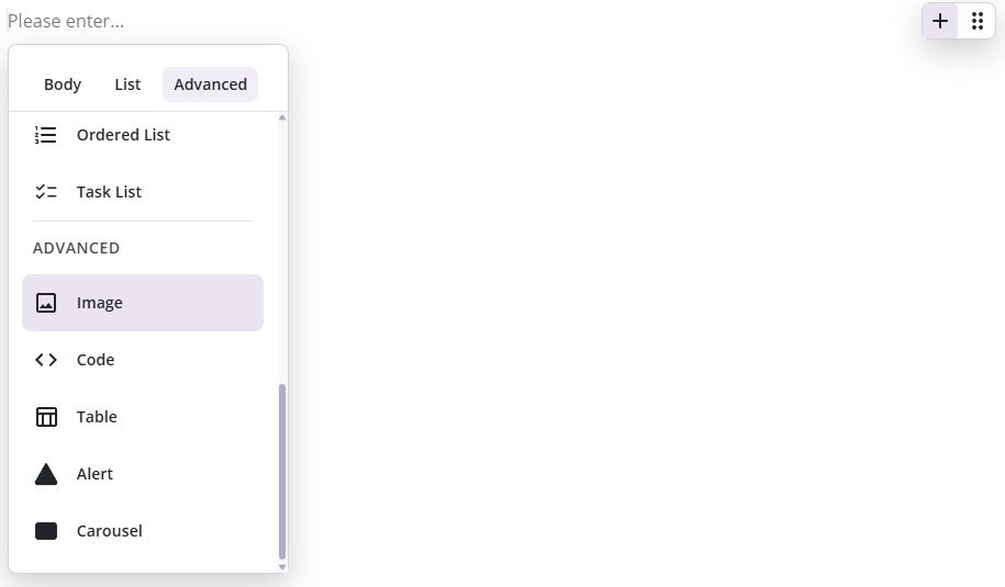
The Simple Label control also supports richer content elements:
- Image: Displays an image within the application. Useful for branding, diagrams, or visual guidance.
- Code: Formats text as a code block, ideal for technical instructions or examples.
- Table: Displays structured tabular data for better readability of grouped information.
- Alert: Highlights important messages such as warnings, tips, or notifications.
- Carousel: Displays multiple pieces of content (such as images or text) in a rotating or scrollable format.
- Charts: Display data from a named range as an interactive chart.
Charts
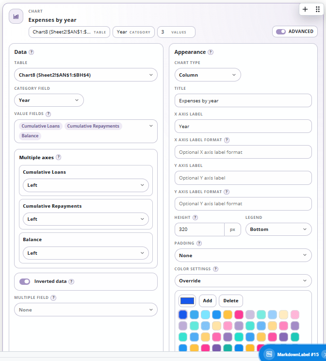
The Charts option allows you to transform worksheet data into interactive visualizations directly within your application. Charts are configured using a named range as the data source and can display one or more data series.
For more advanced charting requirements, SpreadsheetWeb also offers the dedicated Charts control, which supports a wider range of features and customization options. If your application requires complex chart layouts, advanced formatting, Excel chart compatibility, dynamic series behavior, or highly customized visualizations, the dedicated Charts control is generally the recommended approach.
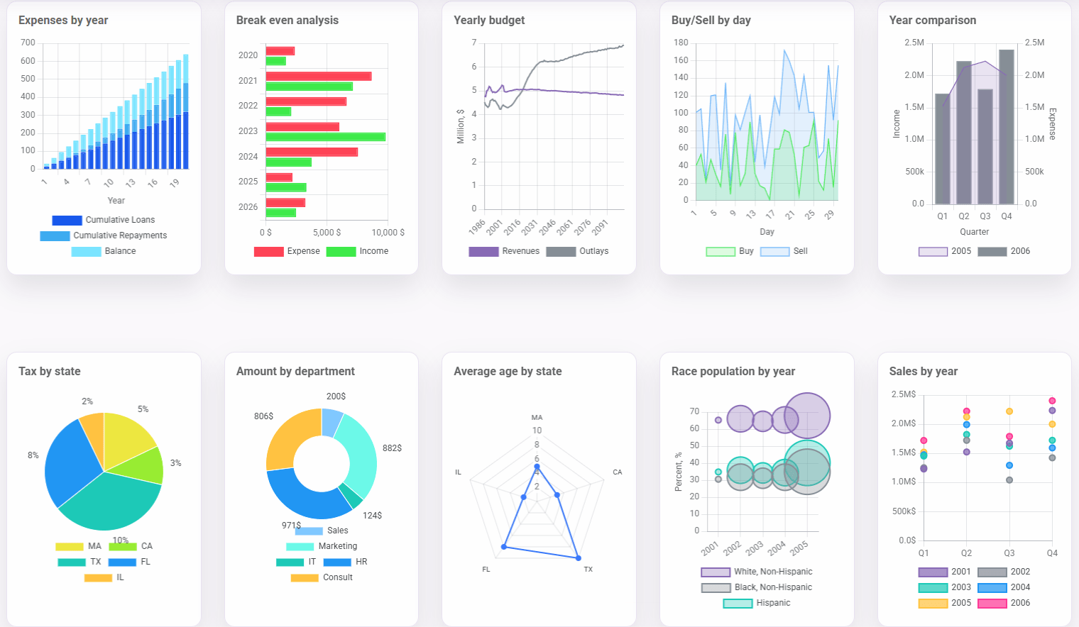
Following is a list of supported chart types:
- Column
- Bar
- Line
- Area
- Pie
- Donut
- Radar
- Bubble
- Scatter
- Combo
When the Charts option is enabled, additional configuration settings become available to control both the data source and the visual appearance of the chart.
The Table setting determines the named range that will serve as the chart’s data source. The selected table should contain at least one category column and one or more numeric value columns. The Category Field specifies which column will be used for category labels, such as years, months, products, departments, or regions. The Value Fields setting allows you to select one or more numeric columns to display as chart series. Selecting multiple value fields makes it possible to compare multiple datasets within the same chart.
For charts that contain multiple series, the Multiple Axes settings allow each series to be assigned to either the left or right axis. This is useful when displaying values that use different units or scales. The Inverted Data option reverses the orientation of the source data before rendering the chart. The Multiple Field setting can be used to group or filter chart data based on a selected field.
The Chart Type setting determines how the data is visualized. The Title field defines the chart title displayed above the visualization. The X Axis Label and Y Axis Label settings allow you to specify descriptive labels for the horizontal and vertical axes. Optional formatting can be applied through the X Axis Label Format and Y Axis Label Format settings.
The Height setting controls the height of the chart in pixels. The Legend setting determines the position of the chart legend or allows it to be hidden entirely. Available positions include Top, Bottom, Left, and Right. The Padding setting controls the spacing around the chart area and can be adjusted to improve readability and layout.
The Color Settings section allows you to customize the colors used by the chart. Individual colors can be assigned to chart series using the built-in color palette. Colors can be added, modified, or removed at any time to match application branding or reporting requirements.