Button Control
A button control is used to trigger specific actions in the workflow of an application, such as navigation, calculation, and saving.
Text
The Text property determines the text that is displayed within the button.
Size
The Size property determines the size of the button and the text within the button.
Button sizes can be configured to be Extra Small, Small, Medium, or Large. The actual sizing of the button may depend on the Cascading Style Sheets (CSS) applied to your application, which can be configured or modified through the Designer’s Stylesheets module.
Color Style
The Color Style property of the button will determine the coloring class applied to the button.
The default supported styles are as follows:
- Default (Standard white)
- Primary
- Primary 2
- Info
- Warning
- Warning 2
- Success
- Danger
The actual coloring schemes are dependent on the Cascading Style Sheets (CSS) applied to your application, which can be modified through the the Designer’s Stylesheets module.
Use Outline Style
The Use Outline Style property signifies whether or not the system will apply the outline style to the button.
If it is applied, the button will appear white with the text and outline matching the color defined by the Color Style property. Hovering over the button will invert the colors.
The actual coloring schemes are dependent on the Cascading Style Sheets (CSS) applied to your application, which can be modified through the the Designer’s Stylesheets module.
Events
The Events selection indicates a series of events that can be triggered when the button is pressed. Currently, the types of events that are supported are as follows:
- Calculate
- Save
- Connectors
- Push Data from Frame
- Custom Actions
- Navigation
- Reset
Calculate
The Calculate event signifies whether or not the button press will trigger a calculation.
Save
The Save event signifies whether or not the button press will trigger a save action. Save actions require a prior calculation action, so enabling the save action on a button will automatically enable a calculate action for the button.
When enabled, data will automatically be packaged in JSON format, capturing inputs from the application’s user interface without additional database setup. However, complex use cases may still require database tables configured through the Databases module. Note that save actions do not execute during application preview; they function only after the application has been published.
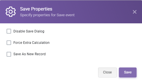
There are several properties that can be configured with a Save event:
-
Disable Save Dialog: By default, a Save event displays a popup window upon completion. To disable this popup, select the Save event and turn on the Disable Save Dialog option.
-
Force Extra Calculation: This option triggers an additional Calculation event after saving.
-
Save As New Record: By default, clicking the Save button during the same browser session updates the existing record in the database. When this property is enabled, each Save action creates a new record instead of updating the existing one.
The Print event is defined by the print processes that you have created using the Print Process Designer module. If you do not have any print processes defined, then you will not see any print actions available.
For each defined print process, you will see a Print event, along with the friendly name that you associated with the print process. You can bind multiple print processes to a single button and the same print process to multiple buttons.
See the Print Processes section for additional information.
The Email event is defined by the email processes that you have created using the Email Process Designer module. If you do not have any email processes defined, then you will not see any email actions available.
For each defined email process, you will see an Email event, along with the friendly name that you associated with the email process. You can bind multiple email processes to a single button and the same email process to multiple buttons.
See the Email Processes section for additional information.
Custom Actions
The Custom Actions event is defined by the custom actions that you have created using the Custom Actions Designer module. If you do not have any custom actions defined, then you will not see any custom actions available.
For each defined custom action hook, you will see a Custom Action event, along with the friendly name that you associated with the custom action. You can bind multiple custom actions to a single button and the same custom actions to multiple buttons.
See the Custom Actions section for additional information.
Navigation
The Navigation Event allows designating a page to a button which will redirect the user upon completing any other specified actions (i.e. calculate, save).
There are four Navigation Types:
- Back: Redirects to the previous active page.
- Next: Redirects to the next active page.
- Go To Page: Redirects to a predesignated page.
- External: Redirects to an external URL.
Active page in this context means a page that is visible to the end user. For example, if the page in the page navigation order is made hidden by a rule, the button will take the user to the next visible page. The order of ‘previous’ and ‘next’ page is determined according to the page order created in the Page Designer.

External Link Type can be Static where a link value must be entered into the Static Link Value field, or it can be set to By Value Of, where the link value will be determined by the named range selection under the Named Range field. Open in New Tab check box will determine whether the URL will open in a new tab.

After selecting the Navigation Event from Events list, you need to set Navigation Type and Go To Page information in the Navigation Properties modal which is shown when you click on the Navigation Event in the selected Events list. When you press the Save button, the Navigation Event will be created and associated with the button. If the Navigation Event is removed from the selected events, it will be automatically deleted. You need to define the Navigation Properties again if you decide to add a new Navigation Event.
Reset
Tag Options
Assign current user’s tag
If you select this option, the current user’s specific tag will be applied to the record. If the application is unrestricted and the user is unauthenticated, then no extra tag will be applied.
This mechanism may be used to replace our legacy system of user assignment – rather than assigning a record to the user, simply apply the user’s tag to the record. Multiple tags can be assigned to a record, and from the Users module in the SpreadsheetWeb Hub, you may configure rules to restrict access, such as only allowing users to see records with their own tags.
Assign all tags associated with the current user
If you select this option, then the current user that is saving the record will have all of their associated tags applied to the record. For example, if the user is associated with an organization tag and a role tag, then those tags will be applied to the record.
Assign specific tags
If you select this option, you will be able to select multiple, static tags that will be assigned to the record upon save. This is an easy way to organize different behaviors between different buttons. For example, if you have tags that correspond to record statuses (e.g., new, submitted, quoted, complete), then you may use several buttons to configure a workflow that allows users to pass between these stages from the user interface.
Assign tags by named range
If you select this option, you will be able to select a single named range that will be used to determine which tags to apply to a record. The value in the named range can be calculated, so you have full control from the workbook to determine which tags should be applied. For example, you may have a priority scale (e.g., high, medium, low) and you may determine the priority of a quote dynamically based on calculated values, then apply tags based on a named range.
The mechanism for this will split a list of tags out of the value in the named range. The valid characters for splitting are semicolon (;), comma (,), colon (:), and new line (\n). The split values will then be compared in a case-insensitive manner to the IDs and the Text values of all tags in the workspace; if the value matches one of the tags, then it will be applied.
For example, if the workspace includes tags Apples (ID: 1), Potatoes (ID: 2), and Zucchini (ID: 3), and the named range evaluates to 1;Potatoes,zucchini, all three of the tags will be applied to the saved record.
Note: These options may be used in conjunction with one another. The process will be additive, meaning that selecting “assign current user’s tag” and then defining several specific tags to be applied will apply BOTH the user’s tag and the specific tags.
When updating a record, would you like to…
The prior options determine the general behavior for which tags will be applied to a record. The final option allows you to determine how you would like these tags to be applied on subsequent record saves. If you are editing a record, you can choose to merge the existing tags from the prior edit, or clear them on the subsequent save.
For example, if you have selected the “Assign current user’s tag” option and User A saves the record the first time, their tag will be assigned to the application. If User B edits the record and saves it, the following differences emerge based on this option:
- Clear the existing tags – User A’s tag will be removed from the record and User B’s tag will be assigned to the record.
- Merge the existing tags with new ones – User A’s tag will be retained on the record and – in addition – User B’s tag will be assigned to the record.
Enabled
Indicates whether the button control is enabled.
This can be configured as Always or Never to indicate whether the button is statically enabled or not.
Alternatively, if any Boolean Single Named Ranges (SNR) exist (i.e. ranges pointing to a single cell that evaluates to TRUE or FALSE), then the enabled-ness of the button can be configured to reflect the value of that named range using the ‘By Value Of’ setting.
Visible
Indicates whether the button control is visible.
This can be configured as Always or Never to indicate whether the button is statically visible or not.
Alternatively, if any Boolean Single Named Ranges (SNR) exist (i.e. ranges pointing to a single cell that evaluates to TRUE or FALSE), then the visibility of the button can be configured to reflect the value of that named range using the ‘By Value Of’ setting.
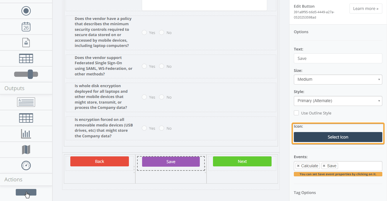
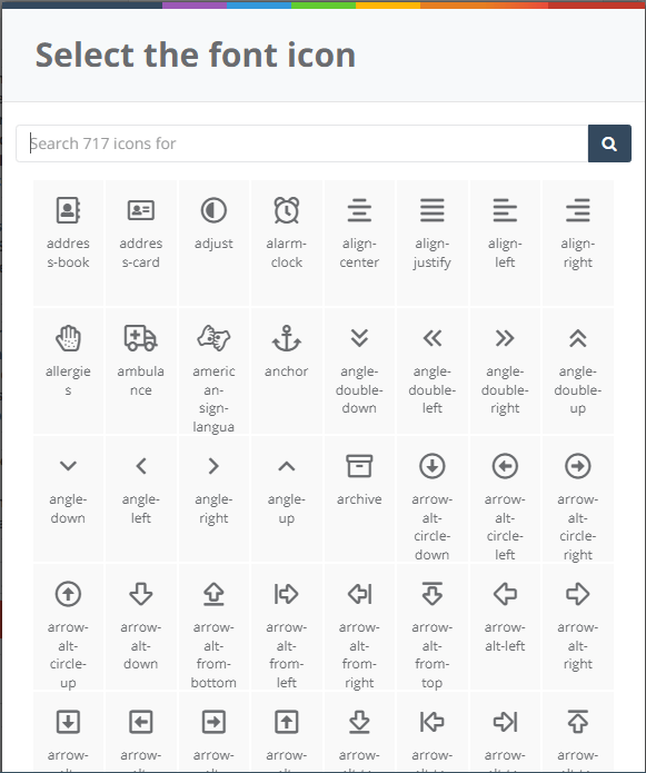
Button Icons
With Button Icons feature, you can set icons to buttons and customize them according to your needs. After adding an action button you can select a suitable icon for the button from Select Button.
You can also change icon alignments as well.
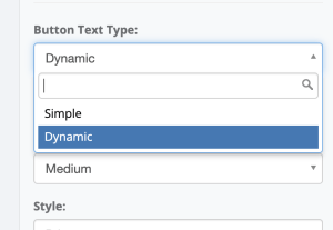
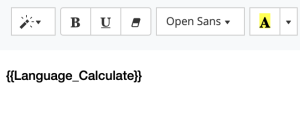
Dynamic Button Labels
Change the button text type to “Dynamic” after adding the buttons.

Enter related named ranges in the content editor using double curly braces(e.g., {{Language_Calculate}}).
You can also enter static text and format it using the features available on the editor screen.