Pages and Navigation
Create and organize application pages, configure navigation bars and page icons, and move between pages in the current SpreadsheetWeb Designer.
Use Pages to create and organize the pages in a Designer application. In Layout & Controls, the page navigator along the bottom of the workspace lets you switch pages without leaving the canvas. The persistent Properties panel on the right shows the settings for the active page or selected control.
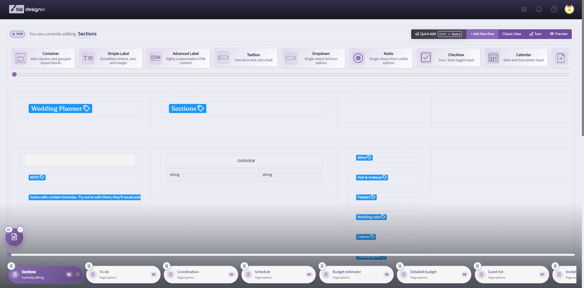
You can create any number of pages from the Page Designer in the designer interface. This menu displays all active pages in your web application. You can create, edit, delete, and reorder pages. The order is used by the published navigation bar and by Back and Next navigation events. You can use a Navigation Bar, any number of Action Buttons, or both methods to let users move between pages.
Navigation Bar
A navigation menu will automatically list all pages that are visible to the end user. You can add a Navigation Bar to any number of pages from Edit Page menu. You can enable Navigation Bar for this page by changing the Navigation Bar Orientation to Top or Left. Selecting None will hide the Navigation Bar. Note that you need to apply this property to each page in your web application individually. Selecting the Left option will also allow setting the Enable Navigation Bar Collapse property. When Enable Navigation Bar Collapse is selected, the navigation bar will have a small icon which can be used to collapse the navigation menu to the left, and only display the Page icons. Enabling the Is Navigation Bar Fixed? option will fix the Navigation Bar so that it will remain on the top or the left side of the page when users scroll through the page.
Mobile Navigation Bar
You can select a different type of navigation menu for your application to be used when it is accessed by a mobile device, or a device with a smaller screen.
- None: The navigation bar will be hidden.
- Top: The navigation bar will be shown on the top of the mobile page.
- Bottom: The navigation bar will be shown on the bottom of the mobile page in the form of a small icon that expands when you click it and shows the pages. This option will also allow you to enable or disable the Bottom Bar Show Only Icons property. When Bottom Bar Show Only Icon is enabled, the navigation menu will only display the page icons, and omit the page names.
Wizard Tracking
You can enable Wizard Tracking for your application by checking the checkbox. Note that, to use this feature, make sure to check Wizard Tracking for every page in the application UI. Also, Wizard Tracking can only be used if Navigation Bar Orientation is selected as ‘None’ or ‘Top’.
Show Disabled Controls As Labels
Enabling this feature will display all disabled controls as labels on this page.
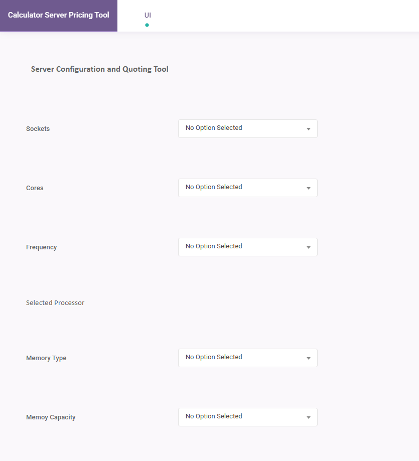
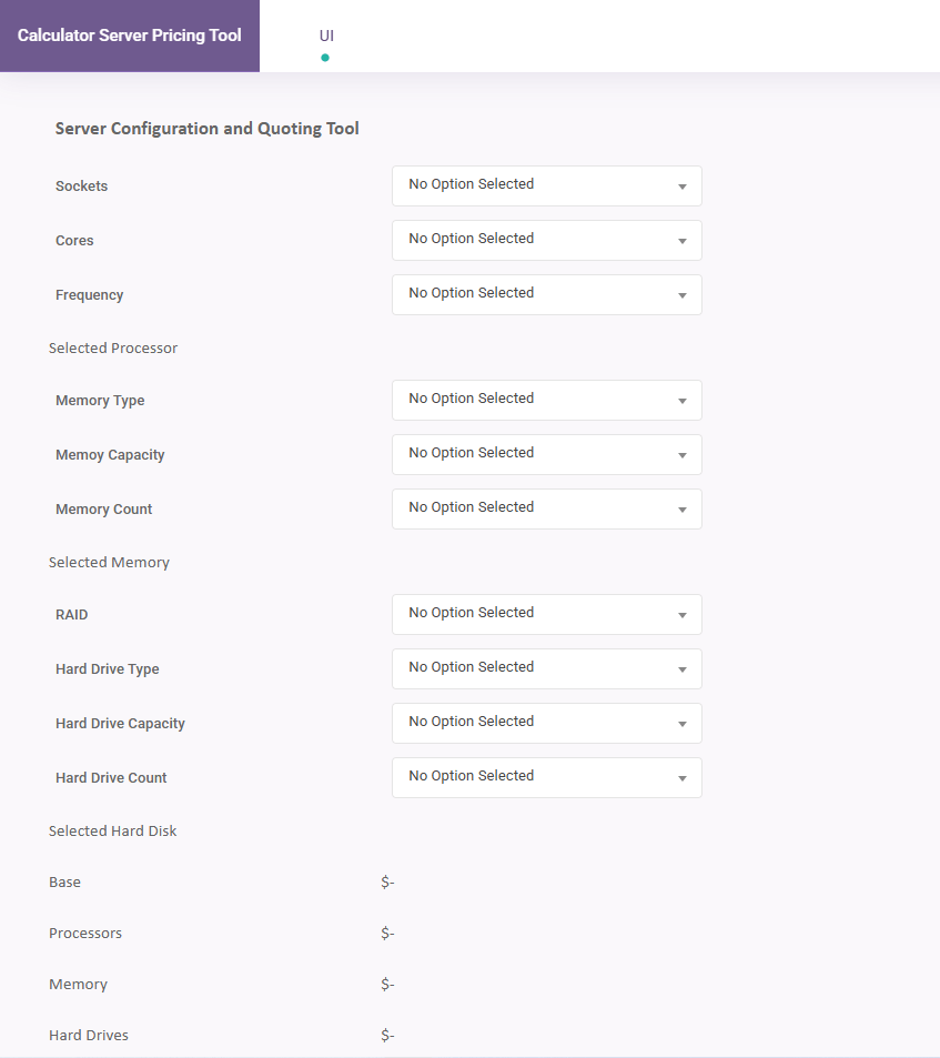
Compact Page Style
Enabling this feature reduces the spacing between controls, resulting in a more compact page layout. This is particularly useful for applications that contain many controls on a single page.
| Without Compact | With Compact |
|---|---|
 |  |
Action Buttons
You can add any number of Button controls in Layout & Controls. Assign a Navigation event to a button, then configure the event from the button's settings in the Properties panel.
Here, you can select a Navigation Type property to redirect users to other pages. Options are,
- Back – Takes the user to the previous page in the page order defined in the Pages module. If there are no available pages to the end user, the button will not do anything other than calculate.
- Next – Takes the user to the next page in the page order defined in the Pages module. If there are no available pages to the end user, the button will not do anything other than calculate.
- Go To Page – This option creates a second property, Go To Page. You can select the specific page name from this input to direct the user to that page. If there are no available pages to the end user, the button will not do anything other than calculate.
- External – This option can be used to redirect the user to another website. Enabling Open in New Tab will open the external link on a new browser tab.
- External Link Type – Determines whether the user will be redirected to a static URL or one generated dynamically by a workbook named range.
- Static – You can manually enter the URL for redirect.
- By Value Of – Allows selecting the URL target from a workbook Named Range.
- External Link Type – Determines whether the user will be redirected to a static URL or one generated dynamically by a workbook named range.
Page Icons
Page icons are small images that are placed to the left of the page name on the Navigation Bar. The selected icon is also displayed on the Pages menu in the Designer interface.
You can add icons to pages from the Select Page Icon button. Simply select the icon you want to use, and press the OK button on the bottom of this menu. The selected icon will be displayed to the left of the page name when you review or publish your application. You can see the selected icon on the Select Page Icon area. To remove an icon, press Remove Page Icon.
Markdown Page
A Markdown Page is a content-focused page type that uses a Markdown editor with a live preview instead of the standard Layout & Controls workspace. Markdown Pages let you create rich, formatted content directly inside your application, such as documentation, onboarding instructions, landing pages, announcements, or internal user guides. Once published, a Markdown Page renders as a clean, responsive page that users can navigate to like any other page in the application.
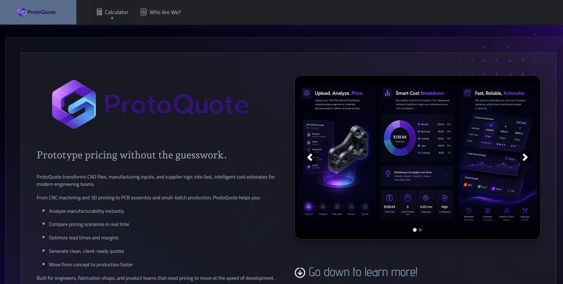
Markdown Pages do not contain UI controls, calculations, or workbook-bound elements. They are intended for static content that supports the rest of your application.
Creating a Markdown Page
To add a Markdown Page, open the Pages menu in the Designer and add a new page. In the Page Type dropdown, select Markdown. Standard pages built in Layout & Controls remain the default. After you select Markdown, the page opens in the Markdown editor instead of the standard page workspace.
You can mix Standard and Markdown pages freely in the same application. Both page types appear in the Pages menu and the Navigation Bar, and both respect page order, page icons, and visibility rules.
Markdown Editor
The Markdown editor provides a split view with the Markdown source on one side and a live preview of the rendered page on the other. Changes are reflected in the preview as you type. The editor supports standard Markdown syntax for headings, lists, tables, blockquotes, code blocks, links, and emphasis, along with several SpreadsheetWeb-specific authoring features.
Icons
You can insert icons directly into Markdown content from the editor toolbar. Two icon types are supported:
- Regular Icons: A single icon inserted inline with your content. Useful for navigation menus, callouts, feature lists, and inline labels.
- Stacked Icons: Two icons layered together to form a single composite icon. Useful for status indicators, badges, and richer visual cues.
Once inserted, icons render in the live preview and in the published page.
Internal Page Links
You can link from one Markdown Page to any other page in the same application, including Standard pages. Use the Insert Internal Page Link option in the editor toolbar and select the target page from the dropdown. This makes it possible to build structured multi-page experiences such as help centers, onboarding flows, or documentation hubs without managing external URLs.
Internal links update automatically if the target page is renamed within the application.
Images and Carousels
You can upload images and insert image carousels into a Markdown Page from the editor toolbar. Uploaded images and carousel images are automatically persisted into the editor content, so image references are preserved without additional manual handling.
Setting a Markdown Page as the Home Page
A Markdown Page can be configured as the home page of your application from the Application settings. This is useful when you want users to land on a content-rich introduction or instructions screen rather than a form or calculator. The Markdown home page will be the first page users see when they open the application, and they can navigate to other pages from the Navigation Bar or Action Buttons as usual.
Markdown Pages do not support UI Controls, Events, or workbook-bound calculations, so use a Standard page when any of those are needed. They do, however, respect the Navigation Bar settings, Page Icons, and page visibility rules in the same way as Standard pages. The Compact Page Style and Show Disabled Controls As Labels options are not applicable to Markdown Pages.