Containers
Organize controls with containers in SpreadsheetWeb Designer. Configure surface styles, colors, tabs, subdivisions, visibility, and dynamic headers.
A container is a subsection that can help subdivide a section into multiple vertical segments.
In the current Layout & Controls workspace, select a container on the canvas and use the persistent Properties panel on the right. Use its appearance settings to apply a coordinated panel style. Copy, cut, duplicate, move, merge, and split actions report their state in the workspace, and paste actions let you choose whether the new element is placed inside or after the selected destination.
Style
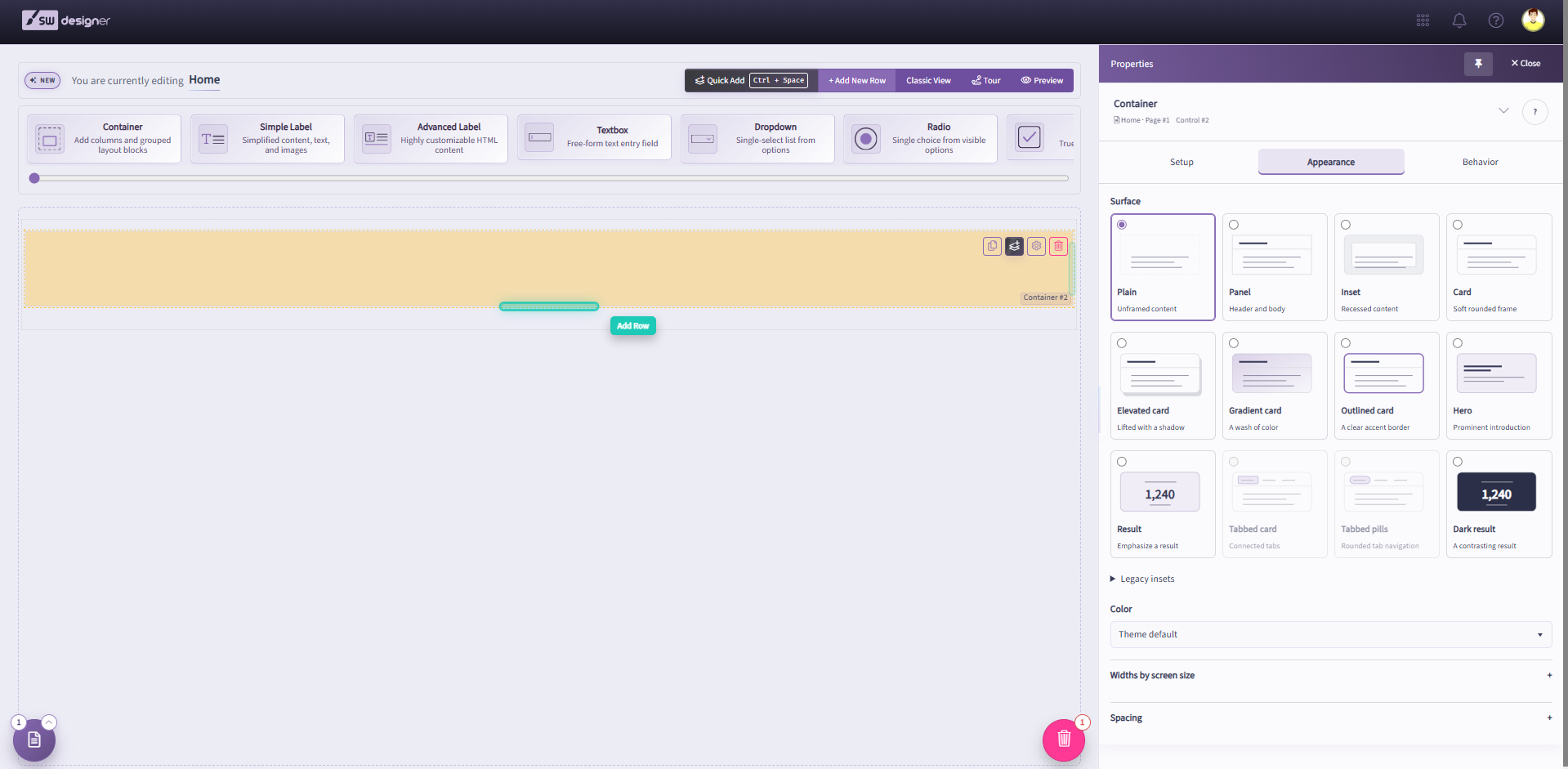
Select the container on the canvas and open Appearance in the Properties panel. Under Surface, choose a style card to set the container's visual treatment. Plain displays unframed content, Panel provides a header and body, Inset uses a recessed content area, and Card adds a soft rounded frame.
Additional surface choices include Elevated card, Gradient card, Outlined card, Hero, Result, and Dark result. The Legacy insets group appears below the surface cards for older inset styles.
For a Panel container, use the header and footer text settings to label those areas. You can further customize the corresponding styles with CSS in the Stylesheets module.
If you select the style Panel and enter any text into the Header Text field, the Container can be made Collapsible.
Collapsible
When the Collapsible property is enabled, the Panel containers can be toggle to show or collapse the Container area and all controls inside it. When you Preview or Publish the application, you can click the header name of a collapsible panel to hide or expand the entire panel. If the Default Collapsed property is enabled, collapsible panels will be collapsed by default during run-time.
Container Color Style
Use Color in the Appearance tab to choose the container's color scheme. Theme default, shown in the screenshot, uses the application's theme. The resulting colors depend on the CSS applied to the application, which you can customize in the Stylesheets module.
Render as Tabs
The Render as Tabs property becomes available when multiple containers are placed inside a target container. Enabling this property displays each inner container as a separate tab within the outer container.
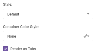
The Header Text field of each inner container defines the tab’s label.
Once the inner and outer containers are configured, the runtime view will appear as shown in the image below:

Subdivisions
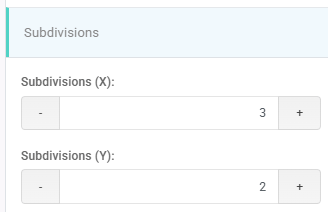
The Container Subdivisions feature in SpreadsheetWeb allows you to split a container into smaller, grid-like sections for more precise control over layout and alignment. Each subdivision acts as a mini-container that can hold controls, functions, or additional elements, making it easier to organize complex forms or dashboards. This feature supports both vertical and horizontal arrangements, enabling side-by-side or multi-row structures that maintain clean alignment across devices.
Subdivisions inherit the styling and behavior of standard containers, including data bindings and events, but offer greater flexibility in designing responsive, professional layouts without relying on custom CSS.
Visible
The Visible property sets the conditions under which the container will be visible. This can be set to Always or Never or By Value Of (this option is only visible in case when there are boolean named ranges exist in underlined Excel Workbook with TRUE/FALSE values).
If there are any Boolean Named Ranges (BNR) defined in your workbook (i.e. single named ranges that evaluate to TRUE or FALSE), then an additional option (By Value Of) will be available. This option allows you to configure a Boolean named range that determines whether or not this section is visible. This can either be calculated or input-based.
Dynamic Header and Footer
This feature is only applicable in Panel style. Go to the section settings and assign dynamic names based on your application’s logic.