Sections
A section is a row in the user interface – all components must be placed within a section. Sections can be subdivided to break up the screen. Each segment of the section contains a built-in container, into which subsequent controls can be placed.
Layout
The Layout property defines the segmentation of a row. There are six templates for segmenting a section, as seen below.

- Single Section – The controls placed within this section will always remain within a single column.
- 50-50 Sectioning – The controls placed within each of these sections will occupy 50% of the width in non-mobile devices and 100% in mobile devices. The second section will collapse below the first section on mobile.
- Lean-Right Section – The controls placed within the left section will occupy 2/3 of the width in non-mobile devices. The controls placed within the right section will occupy 1/3 of the width in non-mobile devices. Both sections will occupy full width in mobile devices. The second section will collapse below the first section on mobile.
- Lean-Left Section – The controls placed within the left section will occupy 1/3 of the width in non-mobile devices. The controls placed within the right section will occupy 2/3 of the width in non-mobile devices. Both sections will occupy full width in mobile devices. The second section will collapse below the first section on mobile.
- One-Third Sectioning – The controls placed within the left, middle, and right sections will occupy 1/3 of the width in non-mobile devices. Each section will occupy full width in mobile devices. The second section will collapse below the first section on mobile and the third will collapse below the second.
- One-Fourth Sectioning – The controls placed within the each section will occupy 1/4 of the width in non-mobile devices. Each section will occupy full width in mobile devices. The collapsed order in mobile devices will be left-to-right (i.e. left-most section at the top, right-most at the bottom).
- Custom – The controls placed within each container will occupy space according to the user’s defined custom sizing of the container. A section is broken down into 12 equally-sized chunks and a given container can occupy any amount of these. For example, a single container can occupy 12 whole spaces, taking up the whole width. This would equate to the Single Section option. Alternatively, you can create 12 single-sized containers, which would each occupy 1/12 of the total width of the screen. Resizing any standard container will automatically set the section to Custom sizing, as well as adding additional containers or deleting existing ones. A new column can be added into a section by clicking on the plus button that appears when you select the section.

When a new column is added to an empty section using the plus button, you will see a separator with three dots. The slider will be highlighted when you hover your mouse over it.

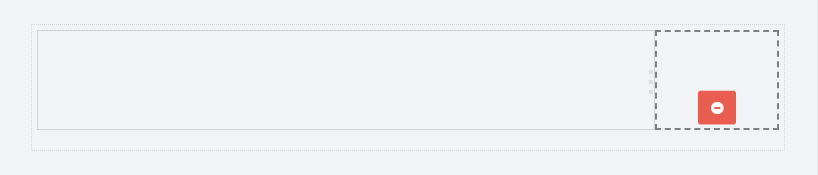
Dragging this slider will allow you to adjust the sizing of the two containers that the slider sits between. The sizing will snap to any of the 12 dividers. Subsequently, a section can have up to 12 containers in a single row. Additionally, you can remove a container by selecting it and then clicking the minus button that appears.
Style
The Style property sets the default style of the section. The Default style will have no identifying style for that specific section. The well styles will share a uniform background and their size determines the amount of padding for these sections.

You can select Well styles such as Small, Medium or Large. The Panel option will make the container display like Card.
Users can customize the actual corresponding styles using Cascading Style Sheets (CSS) in the Stylesheet Designer.
Section Vertical Alignment
The Section Vertical Alignment property determines the vertical orientation of the section. If the section contains columns with different heights, this property will determine the positioning of the shorter columns.

This value can be set to Top, Middle, or Bottom. The default vertical alignment is Top.
The “Section Vertical Alignment” option in SpreadsheetWeb Hub Designer’s User Interface containers just got an exciting new addition – the “Stretch” option. This feature is designed to enhance the visual appeal of your application by ensuring a consistent and aesthetically pleasing look within a section.
When you select the “Stretch” option for the “Section Vertical Alignment,” SpreadsheetWeb Hub Designer performs a smart adjustment. It analyzes the height of all containers within the chosen section and identifies the one with the maximum height. Subsequently, it extends the height of all other containers in the same section to match that of the largest container, creating a uniform and polished appearance.
The “Stretch” option proves to be particularly useful when you want to maintain a cohesive design within a section, ensuring that the visual elements align seamlessly. By automatically adjusting the heights based on the tallest container, the “Stretch” option eliminates the need for manual adjustments, saving you time and effort while improving the overall aesthetic of your application.
How to Apply “Stretch”
Below you can see an application that is using ‘’Top’’ option for the Section Vertical Alignment. In the following section, we will show how to apply ‘’Stretch’’ option for this container while modifying the UI of the application.

Go to Applications page and click on Go to Designer for the application that you you want change container height and navigate to the User Interface Section.
Select the container that you want to adjust height.

Locate the “Section Vertical Alignment” option and choose “Stretch” from the available options.

Once selected, the stystem will automatically adjust the heights of the containers within the section, providing a uniform and visually appealing layout.

After publishing the application, changes will be applied and every user who has access to the application will be able to use the updated version of the application.

This feature is a simple yet effective way to enhance the overall aesthetics of your application. Experiment with the “Stretch” option to find the perfect balance for a professional and polished appearance in your User Interface.
Visible
The Visible property sets the conditions under which the section will be visible. This can be set to Always or Never.
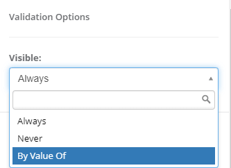
If there are any Boolean Named Ranges (BNR) defined in your workbook (i.e. single named ranges that evaluate to TRUE or FALSE), then an additional option (By Value Of) will be available. This option allows you to configure a Boolean named range that determines whether or not this section is visible. This can either be calculated or input-based.