Application

Application page is where one can find information about their application and can update their application. Application page can be utilized to modify settings that are specific to the web application. The screen is available through pressing Edit on the Designer Home Page. Application page includes several sections:
Access Type
The Access Type setting defines how users can access your application. You can choose from three options:
- Require Authorization: Only authenticated and registered users can access the application.
- Allow Anonymous with API Authentication: Users can access the application without logging in, but API calls still require authentication.
- Allow Anonymous: The application is fully open and accessible to anyone with the link, without any authentication requirements.
These settings allow you to control the level of security and user access based on your application’s needs

Settings
This section lets users edit existing settings of the designer application.

Upload New Workbook
From the underlying Excel model for the application that includes all information for the application can be updated. In order to update the workbook, simply click on the ‘Click Here’ button then select or drag and drop the updated Excel file by clicking on the Spreadsheet File drop zone.

Upon updating the model and pressing the Update button located at the end of the page.

All of the named ranges will be updated and SpreadsheetWeb’s internal system validation will run to ensure that the new model is compatible with the existing user interface, database, and page design. If there are any incompatibilities, the system will redirect user to the Validation Messages screen, where these issues will be further detailed. PS: Updating the Excel model from the design mode will not affect any published versions of the application. The published version will continue to utilize your existing calculation engine until the new version is published, at which point the new Excel model will be the production version. However, the I/O changes from the Excel model will be applied to the designer components themselves (e.g., user interface, page, and database designer will reflect updated named ranges), as well as within the preview of the current transaction (i.e., previewing the transaction will use the new Excel model for calculations).
User Interface Settings
Colors
Designer applications can be configured to use different color sets in visualizations, i.e. charts, and maps. The desired color set can be set by clicking Edit Default Colors button. Color manager window will allow to select a color set from the pre-defined sets. Also, a desired color set can be chosen too. 

Culture
Designer applications support different Culture settings which can be used to set how the thousands and decimal separators will be shown.

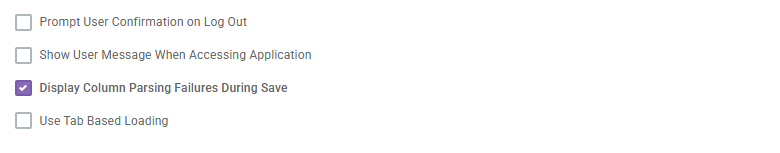
Prompt User Confirmation on Log Out
Enabling this feature will ask for a confirmation from the user before logging out of the application. By using this feature, users can reduce the risk of logging out from the application with unsaved data.

Display Column Parsing Failures During Save
By default, parsing failure warnings are disabled. However, once enabled, users will be able to view parsing failure messages during the save process. These warnings help identify issues with data formatting that occur during parsing.
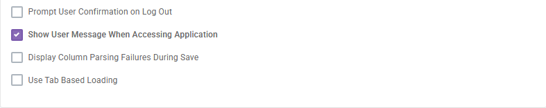
Show User Message When Accessing Application
This feature allows users to see who has entered the application in both the preview and published versions. If a user is logged in, their name will be displayed. If the user is not logged in, the entry will be marked as “unauthenticated.”
Use Tab Based Loading
This feature will be the default for newly-created applications, and minimizes the amount of initial loading needs to be done in the user interface at runtime. Large applications with many pages, controls, and grids should benefit greatly from this feature, so ensure that you try it out by flipping the flag on the Edit Application page in the Designer.

Overwrite Background Color
This feature defines the background color for the entire application. You can specify the color by entering an RGBA code or by selecting it directly from the color picker.

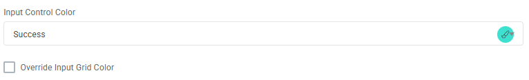
Input Control Color
This feature applies the selected background color to all relevant input fields. An additional option is available to extend the same color to input cells within all input grids.
User Interface Version
This configuration determines which User Interface rendering version the application uses. All newly created applications run on Version 2, while older, legacy applications remain on Version 1 for compatibility.
Version 2 provides enhanced UI customization capabilities, allowing you to enforce consistent styling across the entire application. With this version, you can centrally manage global font sizes, theme colors, and skin selections, resulting in a more uniform, modern, and visually cohesive user experience.

Database Settings
This section allows you to configure database settings for your application, if applicable. By default, all new applications use the Simple Database model, which automatically captures data from all user interface controls in a generic JSON format. This model does not require any database design.
For applications that need more advanced or granular database functionality, you may switch to the Advanced Database model by selecting Convert to Advanced Database. Please note that this action is irreversible and will permanently delete all data currently stored in the existing database.

Enable Auto-Save
Auto-Save feature allows to save data periodically during the user session in case the user forgets to hit Save button manually. To be able to see and use the Auto-Save feature, you must have databases defined for your application and a save button present somewhere in your user interface.

Enabling Auto-Save flag will make two additional options visible: Auto-Save Should Use Properties from Following Button and Auto-Save Interval.
The Auto-Save Should Use Properties from Following Button field is a dropdown, where you may select from the buttons that are present somewhere in your user interface. These buttons do not need to be visible or enabled to be selected. The purpose of this value is that the auto-save feature will mimic the usage of this button when performing the save action. This means you do not need to reconfigure all of the save-specific features, such as your tag saving behaviors or custom action triggers, to enable auto-save.
The Auto-Save Interval determines how often the auto-save should trigger. This measure is shown in hours (e.g., 01:00 would equate to once every hour, whereas 00:01 would be once per minute). This value is required for auto-save to function.
When a validation rule is triggered, SpreadsheetWeb prevents users from saving or submitting the application until the validation error is resolved. A custom error message is displayed, and users must correct the invalid data before they can proceed with saving or submitting. However, “if auto-save skips validation” is enabled, it does not adhere to validation rules in the same way as manual saves. Even when a validation error occurs, auto-save continues to function at the predefined intervals (e.g., every minute), allowing data to be saved automatically despite the presence of unresolved validation issues.
Enable Record Suggestion
There are cases where you may want the user to be prompted as to whether they would like to continue editing a record that they were previously working on the last time that they were in the particular application.
To accommodate this feature, we have enabled the Enabled Record Suggestions functionality. When a user creates or edits a record under an application, that information will be stored. The next time that the user enters the application without selecting a record from Data tab, the system will prompt them with a message, indicating that the last time they were here, they were editing a record, and ask whether they would like to return to continue editing that record.
This only works with authenticated users. If – for some reason – the record that the user was originally working on is no longer accessible to that user (e.g., the tags have changed, resulting in it no longer be accessible), then the user will not be prompted with the feature.

Enable Record Locking
If your designer application has Save Event, Enable Record Locking feature will help to lock a record to other users while another user is editing it. 
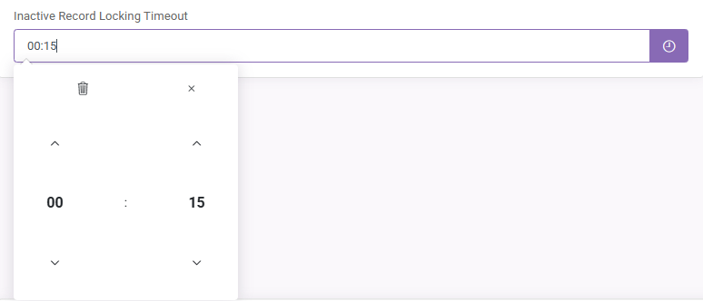
Inactive Record Locking Timeout
If Enable Record Locking is enabled, this value can be set with following format “hh:mm”. Setting this value means that a record will be locked for the selected duration for other users but for the user which opened the record first.
Fonts
This section allows you to update the font styles used throughout the entire application. You can modify the fonts for key text categories, Title, Subheading, Section Header, and Body, in a single place. Any changes you make here will be applied consistently across all pages and components, ensuring a unified and professional visual appearance.

Application Images
Upload Favicon
The Favicon allows users to modify the associated icon that shows up in the tab of the user’s browser. To upload a favicon, click on edit then select an image to upload or simply drag and drop your favicon into the drop zone. Once the file has been successfully uploaded, you can press the Upload button to save the favicon for your application. PS: The permitted format for favicon images is *.ICO, which can be generated using a standard image and any number of web-based or desktop-based image editing tools.

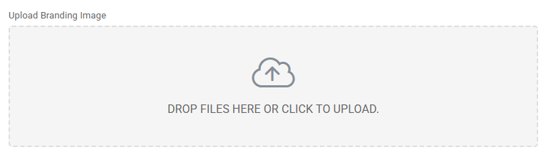
Upload Branding Image
This feature allows users to modify the image that is displayed in the navigation bar of the application. To edit navigation bar branding, click on edit then select an image to upload or simply drag and drop an image into the drop zone. Once the file has been successfully uploaded, you can press the Upload button to save the navigation bar branding for your application. PS: The permitted formats for branding images are *.PNG, *.JPEG, *.JPG, *.GIF, and *.SVG, which can be generated using a standard image and any number of web-based or desktop-based image editing tools.
Upload Background Image
This feature allows users to modify the image that is displayed on the background of all pages in your web application. To edit the background image, click on edit then select an image to upload or simply drag and drop an image into the drop zone. Once the file has been successfully uploaded, you can press the Upload button to save the background image for your application.

PS: The permitted formats for background images are *.PNG, *.JPEG, *.JPG, and *.GIF, which can be generated using a standard image and any number of web-based or desktop-based image editing tools. Please make sure that your image file is under 2MB in size.