Lesson 12 of 15
Charts
A chart is a complex output control that allows users to display a visual representation of a data set in the user interface. Widely used in data analysis…
1 min readAdd the chart in Layout & Controls
Open Layout & Controls and choose a chart from the control gallery across the top of the workspace. You can also press Ctrl+Space to open Quick Add, choose the control, and bind it before placing it on the canvas.
Select the control on the canvas, then configure Setup, Appearance, and Behavior in the Properties panel on the right.
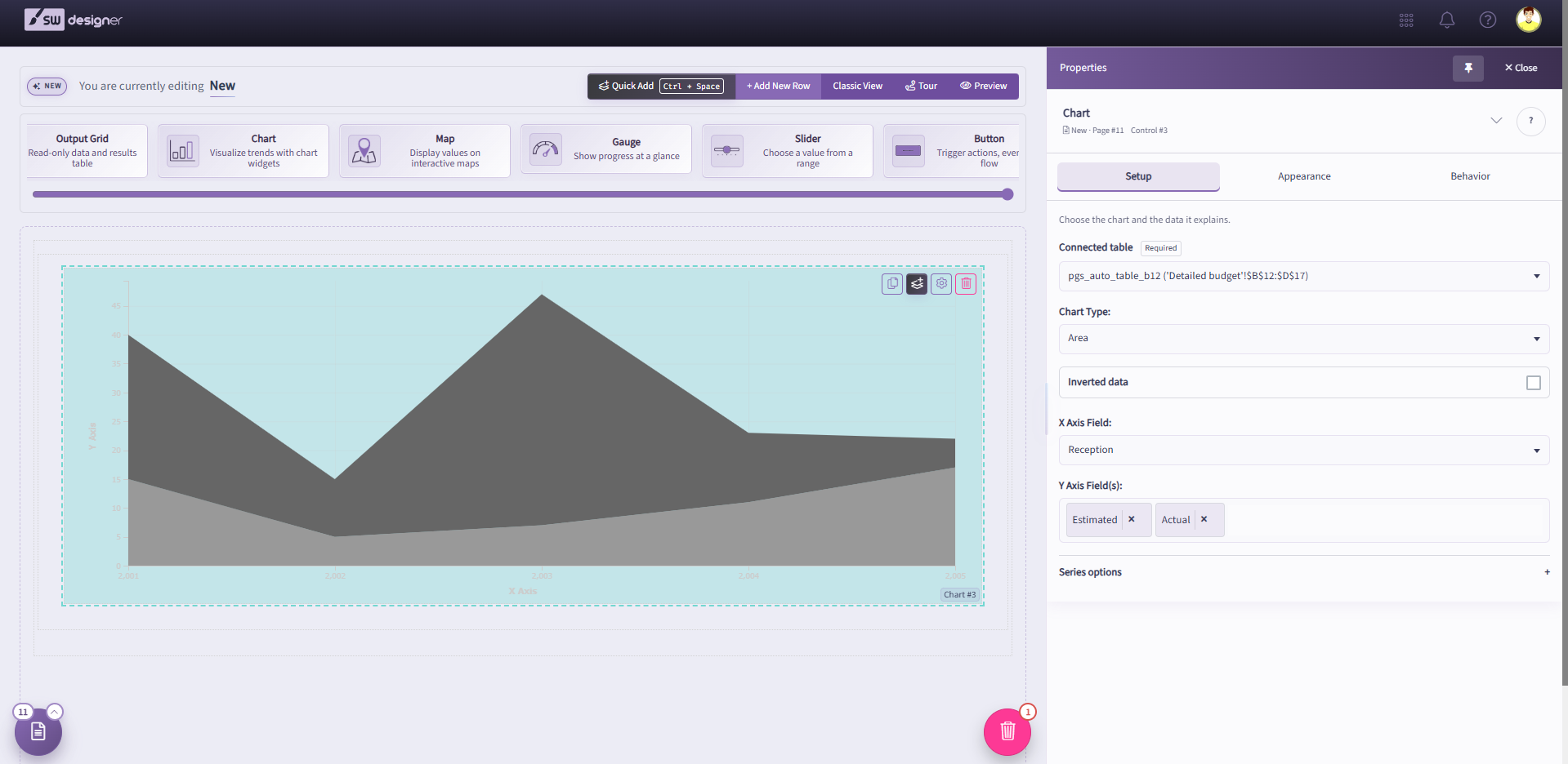
A chart is a complex output control that allows users to display a visual representation of a data set in the user interface. Widely used in data analysis and presentation, charts are a vital component of dashboard reports. Each chart must be associated with a Table Named Range (TNR) from the workbook.
Select the chart on the canvas and open Setup in the Properties panel. Choose the Table Named Range (TNR) that contains the chart data and column headers. Only horizontally oriented table named ranges are supported.
Choose a visualization from Chart Type. The Properties panel displays the settings that apply to that chart type.
The available charts can be categorized into three subsections:
- Single-Axis Charts: Donut, Pie, Funnel, and Pyramid
- Multi-Axis Charts: Area, Bar, Columns, Line, Radar, Scatter
- Special Charts: Bubble, Combo
- Gantt Chart