Lesson 13 of 15
Maps
A map is a complex output control that allows users to visualize geographic data and its relationships. You can choose from hundreds of available maps and…
2 min readAdd the map in Layout & Controls
Open Layout & Controls and choose a map from the control gallery across the top of the workspace. You can also press Ctrl+Space to open Quick Add, choose the control, and bind it before placing it on the canvas.
Select the control on the canvas, then configure Setup, Appearance, and Behavior in the Properties panel on the right.
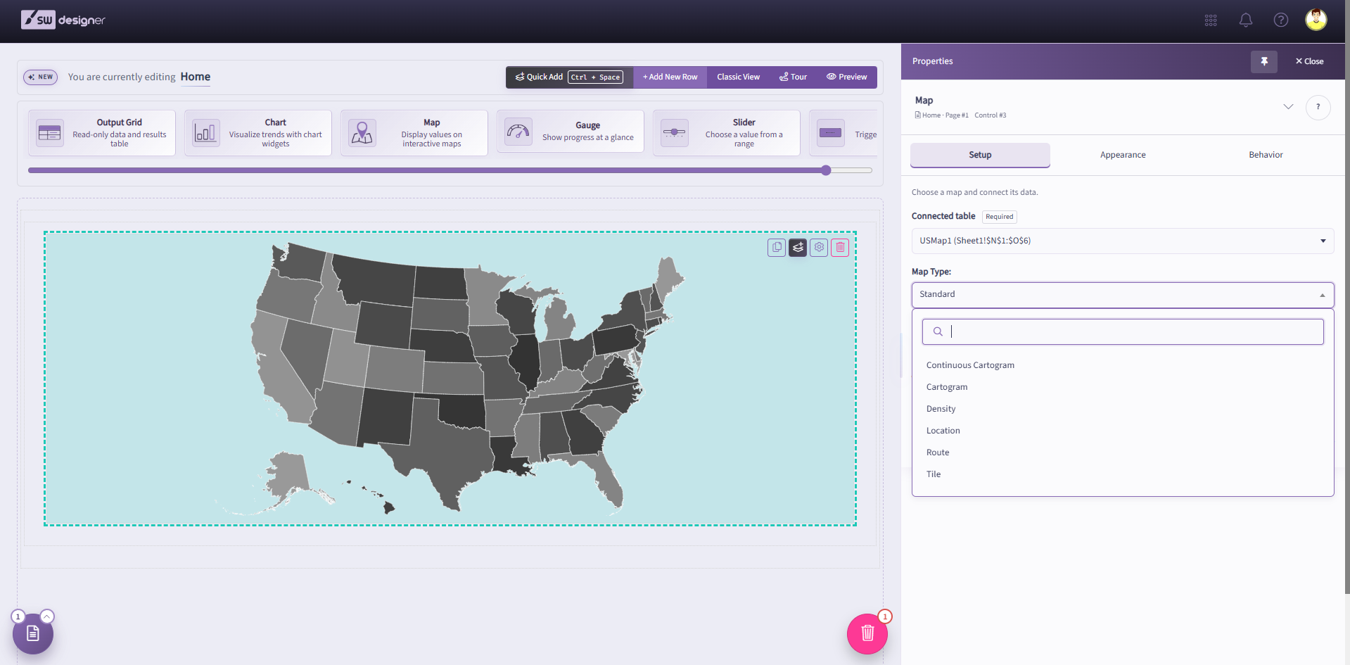
A map is a complex output control that allows users to visualize geographic data and its relationships. You can choose from hundreds of available maps and add location data into your application’s web interface. Each map must be associated with a Table Named Range (TNR) from the workbook.
Select the map on the canvas and open Setup in the Properties panel. Choose the Table Named Range (TNR) that contains the map data and column headers.
For example, when creating a map for the world population, both the country names and the population data should be included in the selected Table Named Range (TNR).
You can select from four distinctive map types:
- Standard Map: The most common map type in data visualization, a standard map shades the map area to display quantitative values.
- Cartogram: A cartogram map uses circles or squares of varying sizes to show regions in accordance with a quantitative value associated to them. This map type is best used to highlight the values of outlier regions, instead of their actual size.
- Continuous Cartogram: A continuous cartogram plots the selected measure on a map by scaling the land borders depending on the selected data field.
- Tile Map: Tile map uses circles, hexagons, or squares instead of the actual land borders to depict the regions. This view is quite useful for showing small regions that are otherwise difficult to read on a regular map.
- Density Map: Density map is a type of heat map which plots values that match the selected latitude and longitude fields. Plot points will have different colors based on the magnitude of each value shown.
- Location Map: Similar to a Density map, Location map plots data on a latitude and longitude basis. The data shown on a Location map will have circles of different sizes, which signify the each value.
- Route Map: Route map can plot a path from point A to point B (or C, and D, and so on), using a numeric or date field. This effectively sorts longitude and latitude data in the order that they appear on the order field.