Build applications
User Interface Controls
In this course, you will learn more about each User Interface Control in Designer applications, with which you can modify the contents of your page.
Start course- Lessons
- 15
- Level
- Beginner
- Format
- Self-paced
Build an application interface with controls
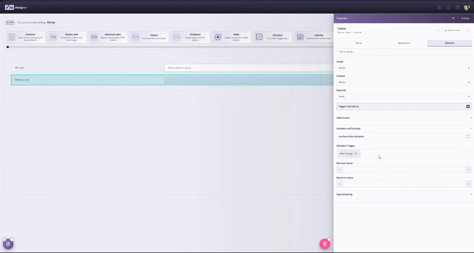
This course introduces the controls available in Layout & Controls. Choose controls from the gallery across the top of the workspace, or press Ctrl+Space to use Quick Add. Quick Add can configure a control and bind a compatible named range before you place it on the canvas.
After placing a control, select it and use the Properties panel on the right. The current Designer organizes settings under Setup, Appearance, and Behavior.
Requirements
- A SpreadsheetWeb Control Panel account. You can signup for a trial account here.
- A Designer application created from a workbook containing named ranges.
Course curriculum
What you’ll learn
- 01Sections and ContainersBuild responsive layouts with sections and containers in SpreadsheetWeb Designer. Configure columns, surface styles, and colors in the Properties panel.
- 02TextboxA textbox is a basic control that allows user to input values for capture, storage, or calculation. Each textbox must be associated with a Single Named…
- 03CheckboxA checkbox control allows end users to enter a TRUE or FALSE value. Each checkbox must be associated with a Boolean Single Named Range (B.SNR) in the…
- 04DropdownA dropdown control allows users to select a value from a defined list for data entry. Each dropdown must be associated with a Single Named Range (SNR) in…
- 05Radio ButtonA radio button list control allows users to select a value from a defined list for data entry. For the List Box variation of the Radio Button control, see…
- 06CalendarA calendar control is a basic control that allows user to select dates and/or times for data entry. Each calendar control must be associated with a Single…
- 07File UploadA file upload control is a drag-and-drop control that allows user to upload files to the server for storage upon performing a save action. Each file upload…
- 08Input GridsAn input grid is a control that allows the user to select and edit a range of items corresponding to a Table Named Range (TNR) from the spreadsheet model.…
- 09SliderA slider is a control that allows user to input values by shifting a horizontal or vertical button within a predetermined minimum and maximum values. Each…
- 10Advanced LabelAdd formatted text, rich HTML content, and dynamic named-range values to an application with the SpreadsheetWeb Advanced Label control.
- 11Output GridAn output grid is a control that allows the user to view a range of items corresponding to a Table Named Range (TNR) from the spreadsheet model. These…
- 12ChartsA chart is a complex output control that allows users to display a visual representation of a data set in the user interface. Widely used in data analysis…
- 13MapsA map is a complex output control that allows users to visualize geographic data and its relationships. You can choose from hundreds of available maps and…
- 14GaugesGauges are output controls that display a visual representation of a cell value in the user interface. Widely used in data analysis and presenting key…
- 15Action ButtonA button control is used to trigger specific actions in the workflow of an application, such as navigation, calculation, and saving. The Text property…