To create a Dashboard, click Create a new Application when you’re on the Control Panel, select Dashboard, and click Next.

You can give this Dashboard a name from the Name of the Report field. Select an Application dropdown will list all available applications with data, and user imported data. Click Next once you make your selection.

Step 3 contains application-level options like Access type, Group assignment, and Notes. Unrestricted Dashboards will be visible to all users that have the application URL, whereas Restricted applications can only be accessed by users authenticated in your SpreadsheetWEB account. Groups can be used to limit access to this Dashboard by only allowing users who belong to the same group (admin-level users are not affected by this). Notes are only displayed on the Applications page and are not visible to the end users accessing the Dashboard directly. When you’re done with these options, click Next to finalize your selections and create the new Dashboard.

Opening a Dashboard by clicking its name on the Control Panel will open that application in ‘read-only’ mode. To edit a Dashboard application, click the orange Edit Dashboard button.

In ‘read-only’ mode, you can’t add, edit, or delete any visualizations, and you can only interact with pinned filters. To make changes in a dashboard, you must open it in ‘edit mode’.
Creating Visualizations
To create new visualizations, click the New Visualization button on the top menu when the Dashboard application is opened in ‘edit mode’.

Begin by selecting a visualization category from the Visualization Types menu. You can choose from dozens of different types of Charts, Diagrams, Maps, Gauges, and Other components (i.e. Pivot tables).
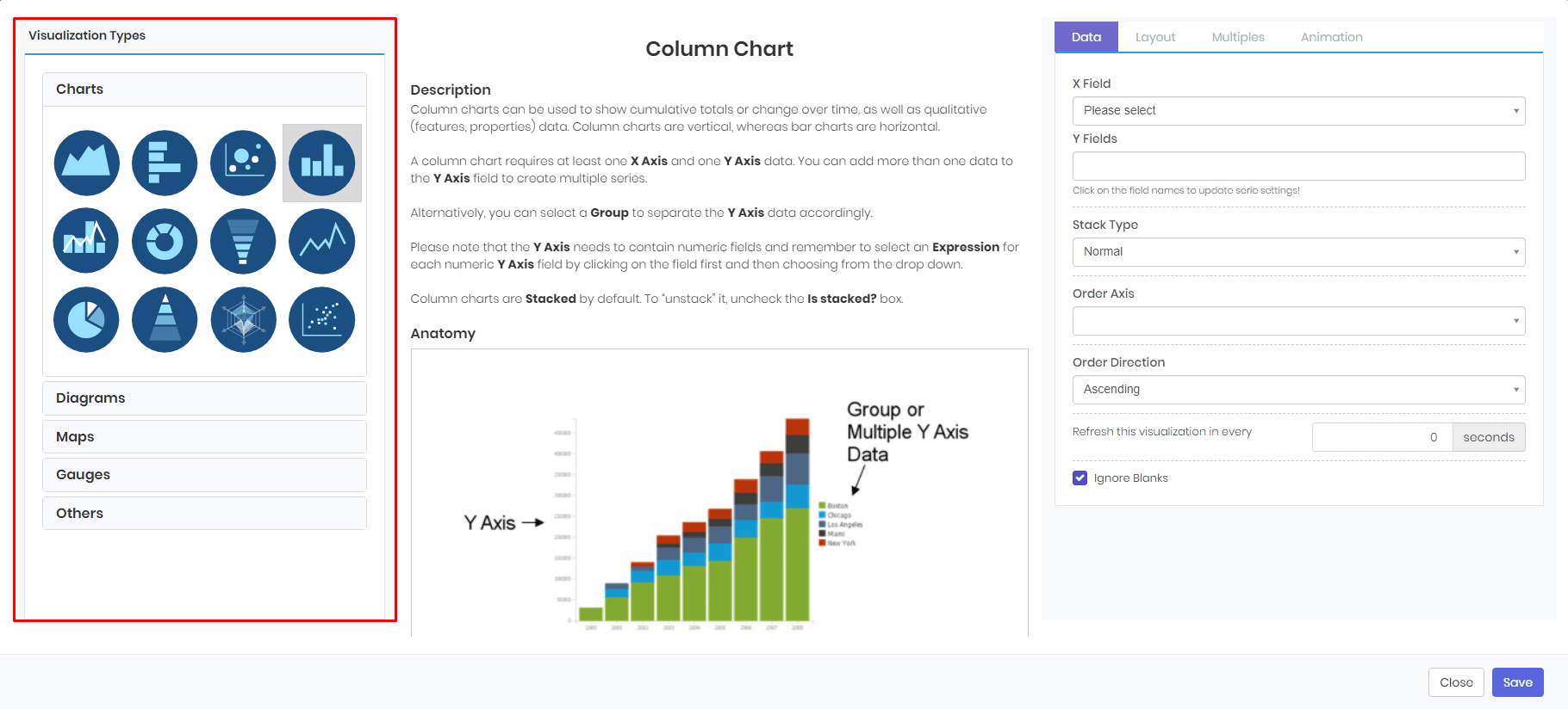
The middle section of the visualization window gives additional information about the selected visualization type.

The right-side of this window contains customization options under 4 tabs: Data, Layout, Multiples, and Animation.

Data
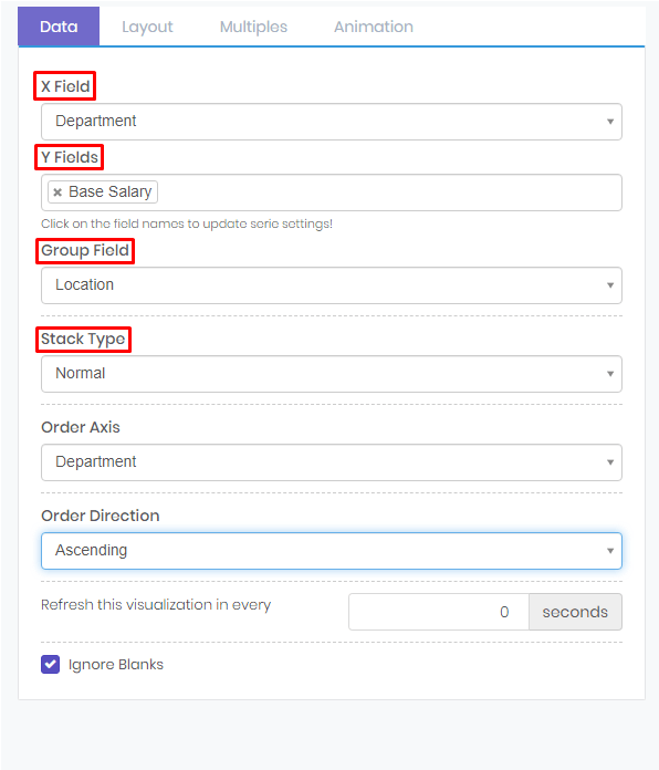
You can select the data columns you want to visualize from the Data tab.

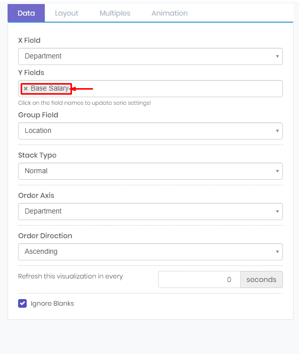
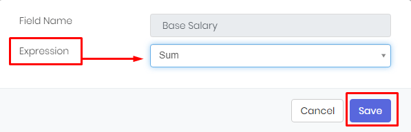
Here, you will get various options based on the visualization type you’ve selected. For example, Column Chart will give you the options for selecting an X Field, any number of Y Fields, an optional Group Field, and a Stack Type. You can select from appropriate data columns for each section from the corresponding dropdowns. You can assign an Expression to a data column by clicking its name in the selection box.
Select the Expression you’d like and press the Save button to apply your changes.
Layout
The Layout tab contains options to customize the formatting and style of axes, legend items, and tooltips of a visualization.
