Dashboards
SpreadsheetWeb Hub allows users to create interactive dashboards that can be customized to fit the needs of the user. SpreadsheetWeb Hub dashboards are…
SpreadsheetWeb Hub allows users to create interactive dashboards that can be customized to fit the needs of the user.
SpreadsheetWeb Hub dashboards are interactive, so users can explore the data and interact with the widgets to gain insights and make decisions based on the information presented. Dashboards can be configured to combine data from multiple applications. However, dashboards can only consume analytics data that is available through the Analytics module in Workspaces.
To create a dashboard in SpreadsheetWeb Hub, follow these steps:
Login to your SpreadsheetWeb Hub account and, go to the “Dashboard” section in the left-hand menu. Click the “Create Dashboard” button.
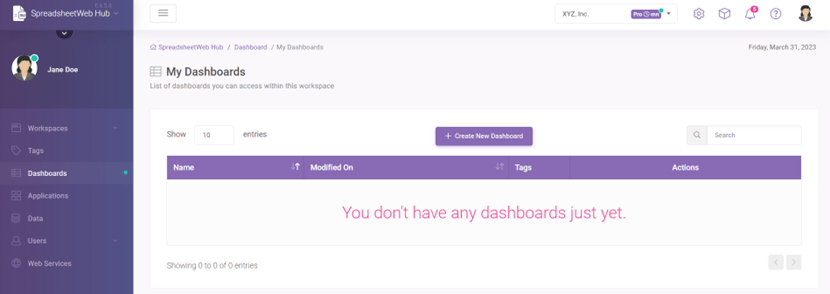
Give your dashboard a name.
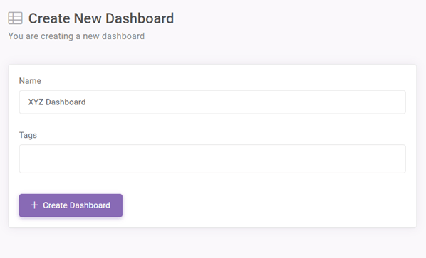
You can also assign Tags to a dashboard while creating them to choose who to display.
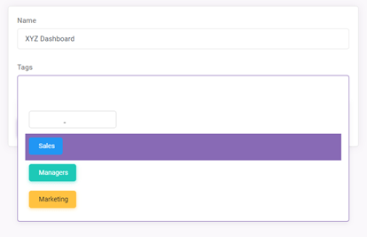
After the dashboard name and Tags are set, click on Create Dashboard button.
Created Dashboard will be listed on My Dashboards list.
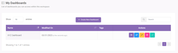
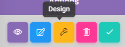
To design a dashboard, click on ‘Design’ button located under ‘Actions’.
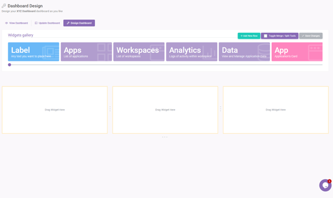
From this page you can design the dashboard.
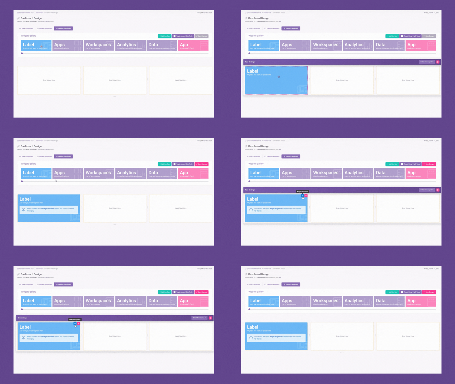
Drag and drop Widgets to add them to the dashboard.
There are several different types of widgets available;
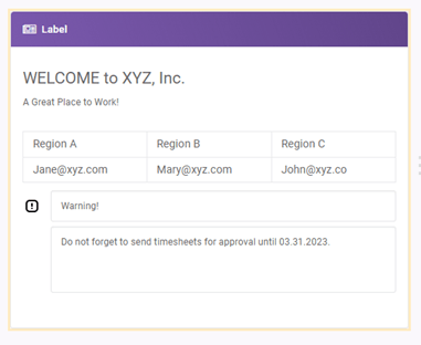
Label
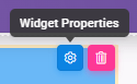
You can add a text to display in the dashboard. To add a Label drag and drop the Label Widget. Click on Widget Properties button.
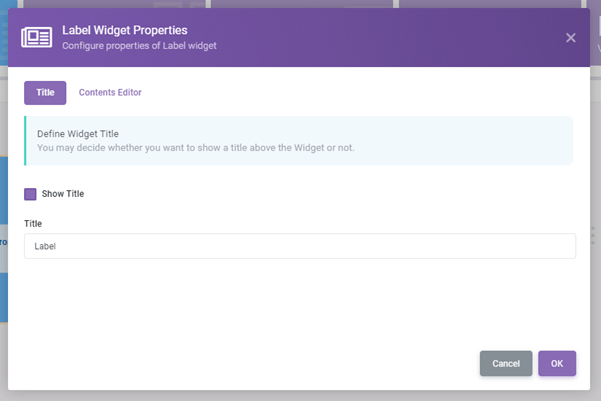
From the Title tab you can choose display a title.
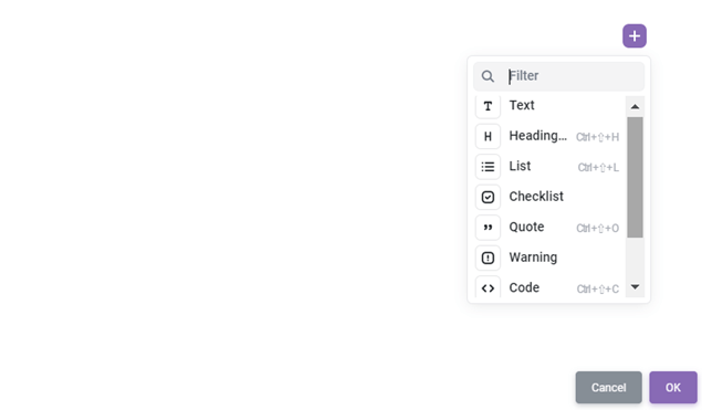
From Content Editor tab you can add different contents to display in the Label Widget. Click on ‘+’ and choose the content type you want to add.
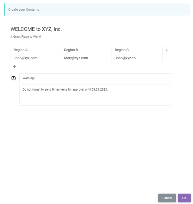
After choosing you can configure it according to your needs.
When you’re done click on OK.
Apps
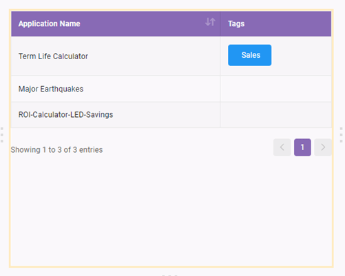
You can add a list of applications created on the selected workspace to display.
From Column tab, you can configure the columns to display in the dashboard. From the Pagination tab you can choose the page size.
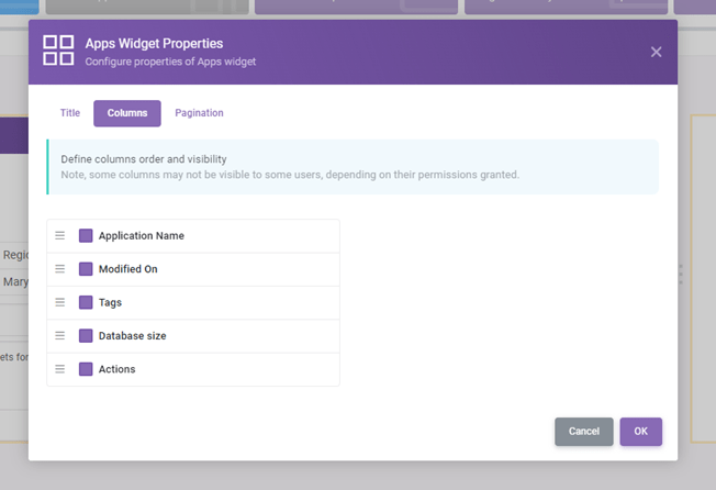
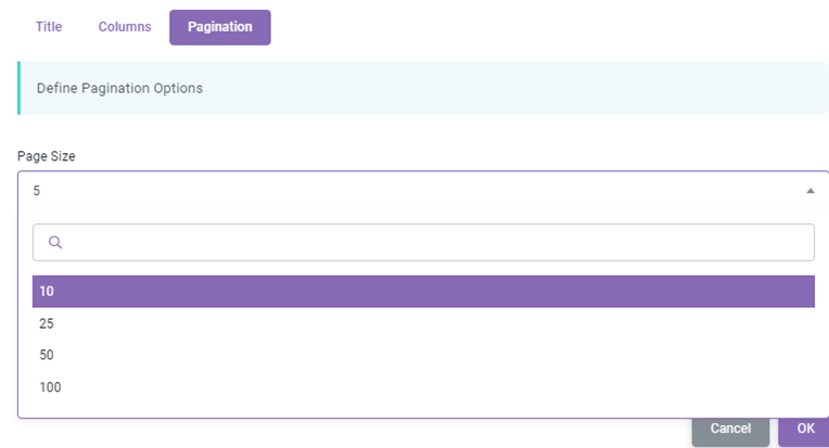
Note that, Every user will only see the applications they have at least read-only access to.
Workspaces
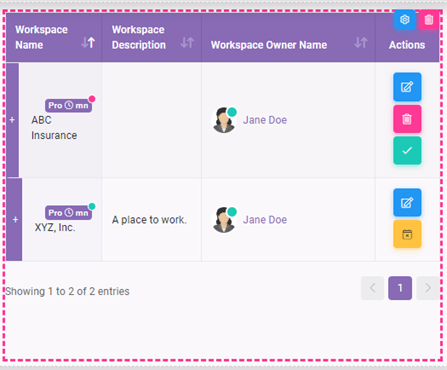
You can display a list of workspaces with the selected information.
From Column tab, you can configure the columns to display in the dashboard. From the Pagination tab you can choose the page size.
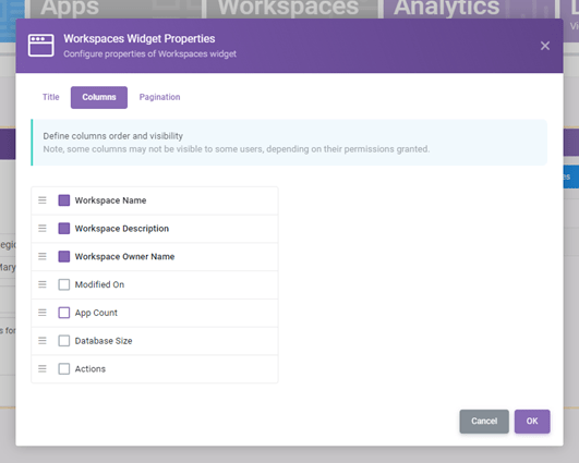
Note that, Workspaces list may differ from user to user since users will see the List of workspaces that they are included in. Also, some columns may not be visible to some users if they do not have necessary permissions.
Analytics
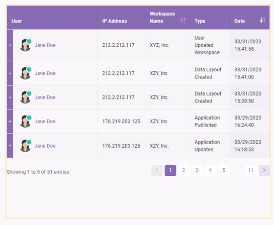
Displays logs of activity within the workspace.
From Column tab, you can configure the columns display in the dashboard. From the Pagination tab you can choose the page size.
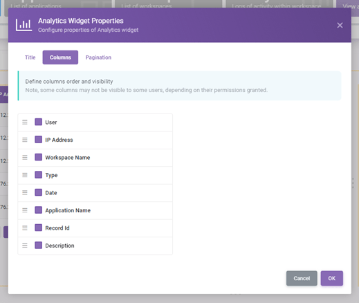
Note that, this widget may not be visible to some users or some columns may not be displayed to them according to the permissions they have.
Data
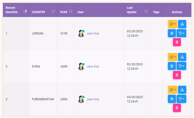
You can display a selected application’s data to users.
From the Application tab, select an application to display its data. You can also choose Data Layout to display in the dashboard if you have saved Data Layouts. From the Pagination tab you can choose the page size.
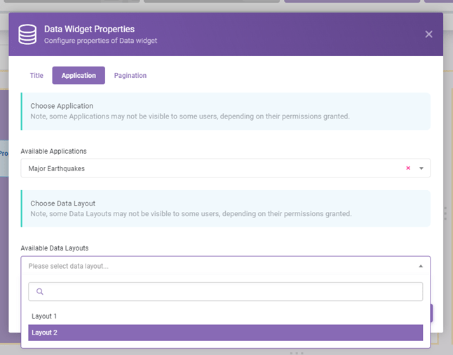
Note that, this widget may not be visible to some users or some columns may not be displayed to them according to the permissions they have.
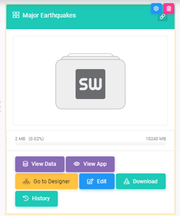
App
You can display an application’s card in the Dashboard with actions buttons for quick access.
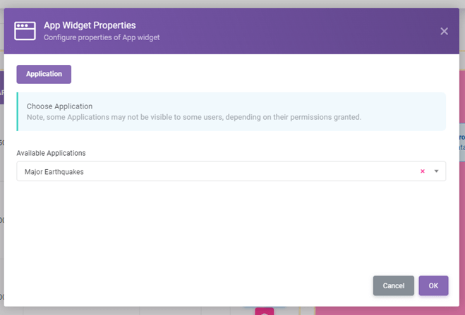
Note, this widget may not be visible some users or action buttons may defer from user to user depending on their account access permissions.
App Chat
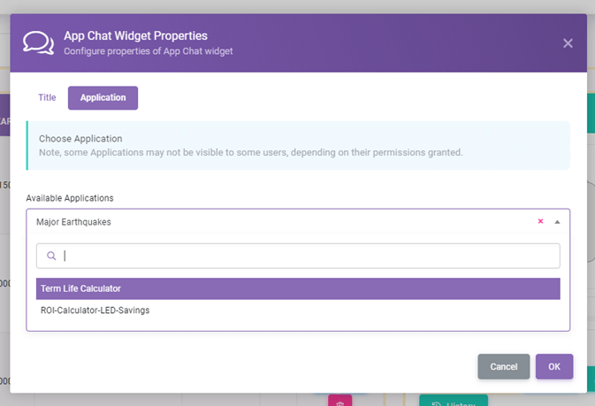
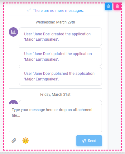
You can display a chat window for a specific application.
From application window, select an application chat to display. When you’re done click on OK.
Note that, this widget may not be visible to some users or some columns may not be displayed to them according to the permissions they have.
Vis (Visualization)
You can visualize analytics data using this widget. This versatile widget allows users to visualize their daily, monthly, and quarterly data in the form of insightful charts, including Timeline, Activity by User, and Activity by Application.
Timeline
The Timeline chart is designed to provide you with a comprehensive overview of different activities within your workspace, such as Application usage, Billing events, and Workspace actions. Presented as a dynamic line chart, the Timeline option enables you to monitor and analyze activities performed on your workspace on a daily basis. This visualization simplifies the process of identifying trends, patterns, and user behaviors, allowing you to make data-driven decisions with ease.
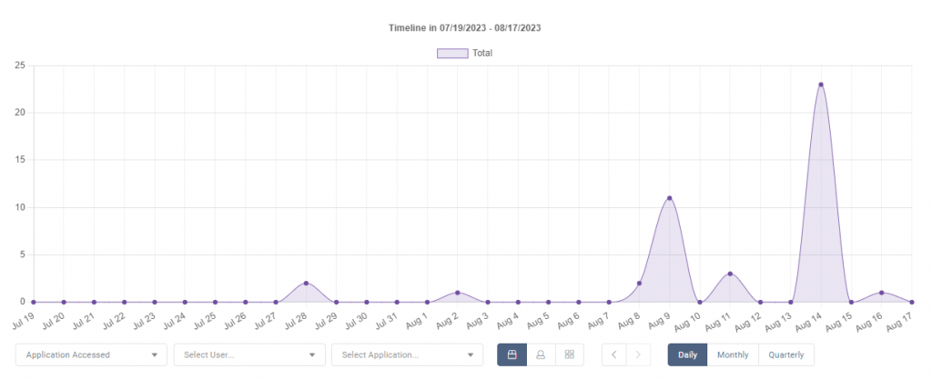
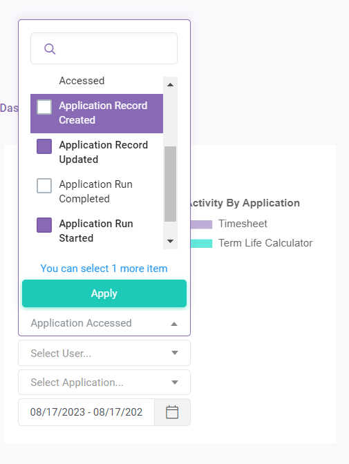
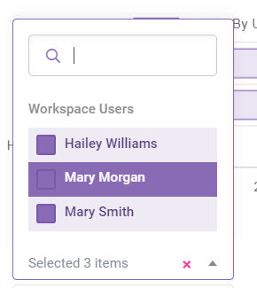
Users can select specific workspace users and up to 5 activities to display.
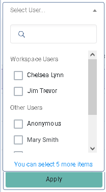
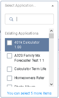
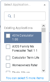
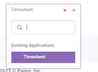
Users can also choose specific applications too.
Activity by Application
With the Activity by Application chart, you can visualize a wide range of application actions, from user access to record updates. Choose between a bar chart or a pie chart to effectively display this information. This widget provides valuable insights into application usage and engagement, aiding you in understanding which areas are most active and which may require further attention.
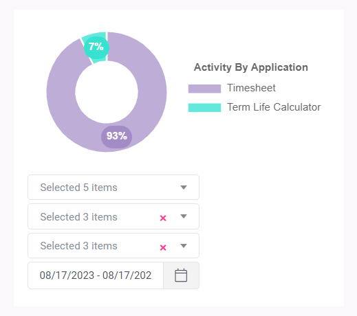
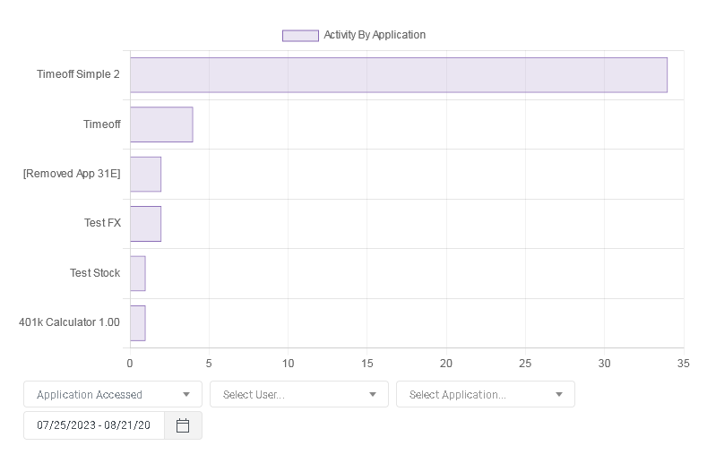
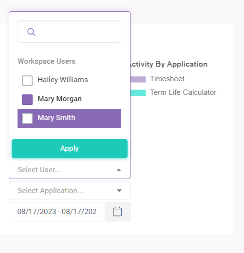
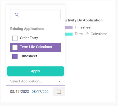
Users can select specific workspace users, applications and up to 5 activities to display.
Activity by User
The Activity by User chart allows you to visualize Application, Billing, and Workspace activities attributed to different users. Display this information as either a bar chart or a pie chart, providing an at-a-glance view of user interactions. This widget simplifies the tracking and analysis of user activities, helping you identify key contributors and areas of improvement.
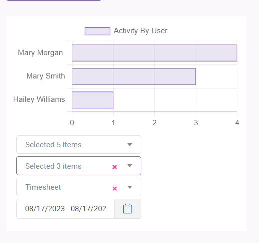
Users can select specific workspace users, applications and up to 5 activities to display.

Using the new Vis Widget:
Access the Dashboard: Log in to your SpreadsheetWeb account and navigate to the dashboard where you want to add the Vis Widget or create a new dashboard.


Add the Vis Widget: Drag and drop the Vis Widget
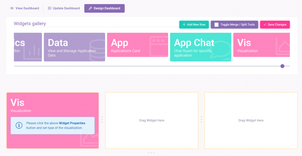
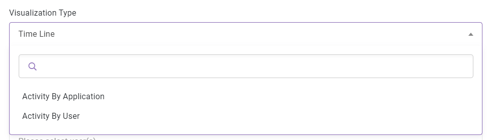
Choose Your Visualization Type: Click on Widget Properties and select from the Timeline, Activity by Application, or Activity by User options, depending on the insights you want to gain.
Configure Settings: Customize your widget by adjusting settings such as time periods, chart type (depend on the visualization type), and any filters you want to apply.
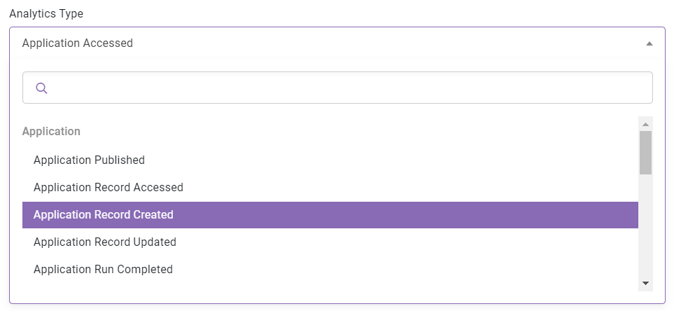
Analyze and Explore: Once configured, the Vis Widget will dynamically generate the chosen visualization, allowing you to explore, analyze, and draw valuable insights from your data.
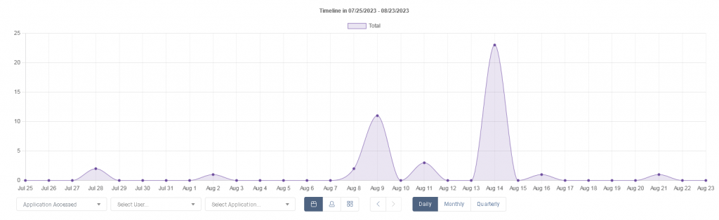
The Vis Widget is a powerful tool that empowers you to transform raw data into actionable insights. By offering Timeline, Activity by User, and Activity by Application visualizations, this widget enables you to make informed decisions, identify trends, and optimize workspace efficiency. Harness the potential of data visualization with the Vis Widget and elevate your data-driven strategies to new heights.
We’re excited to see how you’ll use the Vis Widget to enhance your SpreadsheetWeb experience. Happy visualizing!